
ฝัง
- เผยแพร่เมื่อ 21 ก.ค. 2015
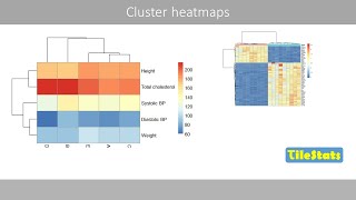
- Interpreting Heat Map Visualizations: Learn how to interpret data presented in heat map visualizations; Consider heat map visualization configuration options which may not be intuitive. This video is current as of Spotfire 6.5. Some interactive features in the original video are not available in TH-cam. The original is available here: learn.spotfire.tibco.com/mod/u... (Click "Login as guest" to access that link if needed)
- วิทยาศาสตร์และเทคโนโลยี


![[ไฮไลต์] ฟุตบอลชาย ญี่ปุ่น vs ปารากวัย รอบแบ่งกลุ่ม | โอลิมปิก 2024](http://i.ytimg.com/vi/X_BeGaAv1oM/mqdefault.jpg)


Pretty clear explanation. Thank you
nice piece, I like the clarity .
See how to create heat map th-cam.com/video/MY29ilY_r0A/w-d-xo.html
Thanks for the more than amzing video :)
See how to create heat map th-cam.com/video/MY29ilY_r0A/w-d-xo.html
That was an amazing explanation of heat maps. It cleared a lot of things for me (and I am a doctor!) So again, thanks
See how to create heat map th-cam.com/video/MY29ilY_r0A/w-d-xo.html
Overall it is numeric data which can not be described in one page can be described in colours easily in one page in easy format. Right?
how can we access the sample file?
See how to create heat map th-cam.com/video/MY29ilY_r0A/w-d-xo.html