@Programming-m5t when : :before or : : after pseudo-element is on top of the button it does not work as we expect it to, it does not hide the text inside of the button , the text always stay on top (I am only talking about the pseudo elements mentioned, I don't know how others work).
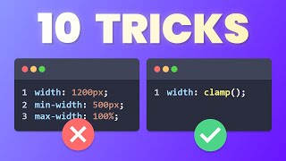
Just FYI to everyone, magic numbering the width and height is a pretty bad solution and you would need different magic numbers for every button. If there is more text in the button it will be wider and give you more border on the x axis, so you'll have to lower your magic number. A much... much better approach is to use negative margin, button::after{ content: ''; position: absolute; inset: 0; margin: -0.2rem; border-radius: 1000px; background-image: linear-gradient(to bottom right, #008cff, #e100ff); z-index: -1; } this button will have the same border thickness, no matter how tall or wide the button is. instead of width and height of 100% btw, just use inset: 0, it means the same thing but is less code.
Me too. I solved, maybe the button is on a navbar whit a “relative” position on the “absolute” position of the “after::button”. So, i solved by putting the navbar at z-index: 1 and leave the “after::button” at z-index -1.
@@TALOB123 the z index of the button is already 0, in the video the z index of the PSEUDO element is set to -1. To noumbissistael's point, that is super confusing and why setting the index of the button to 0 is not explained at all in the video. The reason it works is probably because setting z index to any value creates a new stacking context, even though you're setting it from 0 to 0.


The work is awesome ❤ nice work bro❤
3:08 can somebody explain when we set the z-index to zero in the hover part why the text wasn't covered by the pseudo element?
I would like to know its why too
rel
I was having conflict with transform: translate(). After deleting it and using another method it was working
@Programming-m5t when : :before or : : after pseudo-element is on top of the button it does not work as we expect it to, it does not hide the text inside of the button , the text always stay on top (I am only talking about the pseudo elements mentioned, I don't know how others work).
stacking context
Just FYI to everyone, magic numbering the width and height is a pretty bad solution and you would need different magic numbers for every button. If there is more text in the button it will be wider and give you more border on the x axis, so you'll have to lower your magic number.
A much... much better approach is to use negative margin,
button::after{
content: '';
position: absolute;
inset: 0;
margin: -0.2rem;
border-radius: 1000px;
background-image: linear-gradient(to bottom right, #008cff, #e100ff);
z-index: -1;
}
this button will have the same border thickness, no matter how tall or wide the button is.
instead of width and height of 100% btw, just use inset: 0, it means the same thing but is less code.
also with inset: 0, you dont need to make the button a display flex or set the justify center or align items
this is actually extremely helpful, thank you.
This was very helpful!
i did the same thing but it is not showing my border image why?
Me too. I solved, maybe the button is on a navbar whit a “relative” position on the “absolute” position of the “after::button”. So, i solved by putting the navbar at z-index: 1 and leave the “after::button” at z-index -1.
what if you wantet the contentof the button to have an opacity, but still have a linear gradient border?
what I am currently facing
Subscribed👍
level ustad g
nice work man
Very well explained
Thanks for making this video 👍👍
how do you able to make this types of css bro this is increadable plese let me know how do you these much proficiency in css
perfect explanation thx
I didn't understand the z-index of 0 please
But it's an awesome video
It's ezy
When ever you hover z index-1 will turn into z index- 0
@@TALOB123 the z index of the button is already 0, in the video the z index of the PSEUDO element is set to -1. To noumbissistael's point, that is super confusing and why setting the index of the button to 0 is not explained at all in the video. The reason it works is probably because setting z index to any value creates a new stacking context, even though you're setting it from 0 to 0.
Thank Sir❤
How can we do transition with gradient?
Can u use transition 0.5 or doesn't work
👌👌🔥🔥
can u make it transparent ? i mean the bg transparent
Very good keep going
It would be really great if u could share the source code so that we can take a look at it
it worked on my computer but not on my laptop,but still thx for the vid
why doing this when u can do border image?
thanks
hey legs be friends in coding
Simple ✅✅🙏
Moreeeee❤
Done it 🎉
try this
body {
background-color: #0b0b0b;
padding: 0;
margin: 0;
height: 100vh;
color: white;
display: flex;
justify-content: center;
align-items: center;
}
.btn {
--radius: 2rem;
padding-inline: 2.3rem;
padding-block: 1.2rem;
border-radius: var(--radius);
border: none;
background-color: #333;
color: inherit;
font-size: 1.2rem;
cursor: pointer;
position: relative;
display: grid;
place-items: center;
transition: background-color .2s ease;
}
.btn:before, .btn:after {
border-radius: calc(var(--radius) + .2rem);
position: absolute;
content: "";
width: calc(100% + .4rem);
height: calc(100% + .4rem);
background-image: linear-gradient(45deg, blue, purple);
z-index: -1;
}
.btn:after {
z-index: -2;
transition: filter .2s ease;
}
.btn:hover {
background-color: transparent;
&::after {
filter: blur(2rem);
}
}
cool af
thankyou