Color Blindness 3: Color Science.

ฝัง
- เผยแพร่เมื่อ 14 ต.ค. 2024
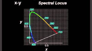
- The tools of Color Science give us deeper understanding of color vision and color deficiency. Confusion Lines show sets of colors that look the same. Neutral Points. Brief review of Color Matching, Color Space and Chromaticity Diagram.


Absolutely fantastic explanation and slides! Thank you - you make a very complex subject much easier to comprehend. I entirely disagree with the comment about too much redundancy. Many of us sincerely appreciate the manner in which you review the basics from your previous videos because it provides a broader context in which we can understand the newer topics better. Thank you for the fabulous lecture series on color vision!
Thank you for your comment. My intent was to make each episode function as a stand alone, but I take your point and will try to limit redundant info in the future.
Also, appreciate the note on Van Gogh which was new to me. In searching I found a commentary on Webvision (from Univ of Utah) you might find interesting.
This is without exception the best explanation of color vision deficiency I have yet found on the web. My only criticism is the enormous amount of redundant material. Removing the 50% episode review and previews the entire series could be reduced to two 10 minute videos. This is also true for your color vision series. The original material would fit into two or three videos. While I think I understand the reasons for stretching it out like a college lecture, a condensed versions of your color vision and colorblindness videos would be an excellent addition to science on the web and more suited to the nature of modern video instruction. I picked this episode to comment on because it contains nearly all the relevant information. It is the heart of the series from which you could base two condensed videos on.
PS. I found it ironic that you often used Van Gough as examples. Recent studies suggest he may have been colorblind, resulting in the riotous palette he used. Being a protanope I never noticed his unusual use of color. They simply look like advanced Impressionists works to me.
Thank you again for such a clear description of both topics.
Thank you so much for making this series, it's wonderful!
What I always struggle to understand is how can we tell which colours Protanoos or Deuteranopes. I get lines of confusion and how everything from red to green more or less looks the same to them but what colour do they see?
Good catch. That was meant to be "trichromat," instead of tritanope.
Sorry about that.
Just added an annotation correction to the video.
Same at 6:34
Tried to do it myself with graphics program, gradient fill,.... Gave up and used public domain version from Wiki.
See (5:12). I thought tritanopia was a colour deficiency by itself, meaning a lack of s cones. So how could a tritanope be fully functioning?
What software did you use to plot the chromaticity diagram?
Looks like R