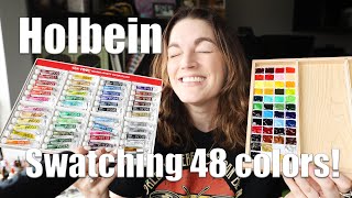
Holbein Watercolor | 18 Set Review

ฝัง
- เผยแพร่เมื่อ 10 ก.พ. 2025
- In this video, I'll review the 18 watercolor set of Holbein. I've had this set for a long time but I'd never reviewed it and let you know what I think it does best, so here it is.
**This is not a sponsored video, all opinions are my own.**
I really appreciate that you are taking the time to check me out, thank you for your support and I hope you enrich your life with some art!
You can support the channel here:
My website: illustrationsb...
Patreon: / illustrationsbypete
Direct Support: paypal.me/illustrationsbypete
For swag and other merch: illustrations-...
Instagram: / illustrationsbypete
Email: pete@illustrationsbypete.com
Products Used along with Affiliate Links. These links will direct you to the product page on Amazon where you can purchase the item. They will not cost you more but they will help out the channel with a small commission:
Holbein Artist's Watercolor Set of 18 amzn.to/3kZgoBv
Arches Cold Press Watercolor Paper amzn.to/3Nnqmug
Hahnemuhle Watercolor Book 100% Cotton amzn.to/3vMsRx0
Pentel Pocket Brush Pen amzn.to/3lYoCdB
Uni Pin Fine Liners amzn.to/3D2p6Fh
Dr. PH Martin's Bombay India Ink Black amzn.to/2Y8utUR
Recording Gear Used:
Sony A6700 amzn.to/47G4oLO
Tamron 18mm-300mm amzn.to/3YH4Zsh
Kingston 128GB SDXC UHS-II V90 Memory Card amzn.to/3YFJSqg
Takstar SGC-598 Shotgun Mic amzn.to/3utpgmf
Synco G2 Wireless Mic amzn.to/325FMPm
Focusrite Scarlett Solo amzn.to/3kYi26w
Lavalier Wind Muff 3 Pack amzn.to/3uCU2cs
Dolica Tripod amzn.to/3a2irhP
Anker Nebula Compact Tripod amzn.to/3kRX7RZ
SanDisk 128GB Extreme SDXC Card amzn.to/3B2A0dA
#youmustwhisperillustrationsbypeteeverytime:) #abstractart


Hoo boy, there is no shortage of gate keeping in the artistic community. But here comes Pete to batter the gates down and invite more people in. 😉😄
I do what I can. 🙂 I appreciate you!
@@IllustrationsByPete I agree, you're doing great :-).
Thank you! 🙂
Hurricane Pete signal#5
New to the medium, I have been watching WAY TOO MUCH watercolor youtube content lately. As much as I appreciate everyone putting their art and experience out there and sharing information, most are torture for my neurodivergent brain because i have a hard time maintaining focus if it gets less engaging and autopilot into doing 16 other things at the same time instead. This guy is an absolute treasure. Even when he gets on a bit of a rant or ramble, its so thoroughly entertaining. I love the personality. Plus there's constantly little nuggets of really useful, very specific information that comes out all along the way on these detours that I have never heard any other artists mention. (Plus I'm actually focused all the way through the video for once. Look at me, I'm learning things!) 😅
Really appreciate these, don't change a thing! 😁
Thank you so much! I'm really glad you get something out of these videos. Don't be afraid to reach out if you have any specific questions. I'm always willing to help if I can. Especially for a potato pirate. One day, I may need to call on you. 🙂 I understand what you are saying but you need to keep one thing in mind, this is your journey. There are good ideas to follow that help move your skill forward but don't let anyone impose rules on you that you don't agree with. Create with intent or with whimsy but experiment when you see something interesting or your mind takes you somewhere else you haven't thought of before. Let your mind take you in a different direction. I usually have no idea what the end creation will be. I start putting color on a page and develop areas as I see them, then I go in with ink and develop them further. Sometimes it turns out great and sometimes it sucks. I just try to find something I like to take to the next one. Welcome to the community! 👍🏻
Art has no rules! That’s what makes art so incredible ❤
I agree. 👍🏻
Well, there are rules. I’ll say that once you understand the rules, you are free to deliberately break them with purpose. If you were asked why you did something, and your answer was, “I don’t know”. Hmmmm, I guess I’ll be a bit confused maybe.
Well, some people line and wash by putting the line first, others do the wash first, some mix their colors before they go on the page, others mix on the page, still some others use paint directly from the pan, some use white, some refuse to use white. Those are the things I am talking about here. But as long as the person is getting the desired results, they should create how ever they want to and not be held to other people's rules. That's all. 🙂
@@IllustrationsByPeteI totally understand where your going. But, those fundamentals, and elements all stem from “the rules”. For example, if you decided to substitute salt for the sugar in a cupcake recipe….
I get you, but I don't think that's a fair comparison. People who have no traditional training can produce amazing art because they've worked it out themselves. Can you give a specific fundamental that someone needs to follow that they can later go and break? I don't see it. I've seen so many teachers explain "the only way" so many times and I never use those methods. I'm not saying my art is anything special, but I accomplish what I intend to. Maybe, if you are trying to copy a specific style then you can learn the way others do it and then you can put your spin on it and do what works for you. I see this in almost every area of life, but I just don't see it in art.
I take single-pigment more as a shopping list determiner, things to use either as is or mix. The blended pigments are convenience colors, colors you use a lot of and are time-savers to have. You can reduce the number of tubes in a given line needed that way.
I agree. 👍🏻
Agree. Single pigment colours are the best
best review of these paints!
Thank you! I'm glad you enjoyed it. 🙂
@ it is very detailed and you provide different perspectives on it, which I really appreciate. Plus the humor and the attitude :-D
Great video! Thank you for giving me permission to like what I like when it comes to watercolor! I've discovered that I prefer to have a palette with an assortment of primary and unique convenience colors instead of mixing all the time; I do mix when I want a certain color but I was feeling guilty for not mixing every color I use. My palette contains a variety of brands, both commercial and handmade, each beautiful and unique in it's own way and it works for perfectly for what I like to paint.
I'm with you. Most of the time I use the paint straight from the pans and that is how I like to work. I'm glad you enjoyed this. 🙂
D.S. Lunar Black. I could paint an entire piece of paper with varying amounts of water and Lunar Black and just stare at it for hours. It is a fascinating pigment to me and the granulation is amazing. Awesome used in big rocks with other colors. Weird, I know.
That's what I love about granulating colors. They make everything look so much more interesting. 🙂
Watercolor graphite here, for a similar effect.
Don't forget - a lot of people paint a piece with fugitive colors (PR83 is an excellent example) then make prints of it, and sell those. That way you can still use the gorgeous color, but will have no lightfast issues with a print.
That is one way to do it. 👍🏻
As always, Pete, your video was informative and fun to watch.
I honestly can’t say which way I like it best, with or without the lines, It’s actually two different paintings all together.
Often I feel the same after I’ve put lines in my art, but then later, glad I did; it’s art. 😊
Hi Denise! I usually lean into liking the lines in the end. It's only while I'm adding them that I second guess myself. Maybe I should just make 2, one with and one without. 🙂
I have a full set of their watercolors. They are great for illustration for the ability to control the paint and detail. I use them with paints with better flow for effects .
I enjoy them. One of my favorite paints to use. 👍🏻
As always, I enjoyed your patter! I like the way you showed us color comparisons with other company’s colors. About the overlining you do, sometimes I really love it, and sometimes they seem to make the piece too dark.Mostly I think it comes out really cool!!
Thank you Anna! I always enjoy hearing your feedback. 🙂
On 99% of your pieces I like the additional line work. On this one for some reason, I preferred the texture of the dry brush effect with the brighter colors. Happy Monday!
Thanks Cherice! I appreciate you. Happy Monday!. 🙂
Got to the end…
The lines are part of your style and design…if every artist did everything the same way art would be very boring. I love to see what you are doing!
Everyone just looks at colors (single pigment or blends) differently. I just bought most of Schmincke’s new colors…and didn’t check to see that “brilliant” colors in their line often means a fluorescent ingredient or pigment has been added. Sure the colors are great…but fluorescence destroys the lightfastness. But…how many people even care about that if the color is wonderful…
Thanks for the feedback. Yes, most people don't really care so long as they like the colors. If it's going in a sketchbook, just for your own enjoyment or scanning it as an illustration, then I say go for it. 👍🏻
Glad to see I wasn't the only one who's pallet got stained from the Viridian. I like the Holbein colors but I think the mission gold watercolors are just as good. They are cheaper and just as bright.
I only tried a couple colors from them but I enjoyed them. I need to get a small set of them to really test out. 👍🏻
Right on!
So now I've seen it completely.
Great review, nicely detailed but not overloaded.
There is also a good rant in the video.🙂
I also like Holbein watercolors. I was able to find a relatively cheap source for these here in Germany, and this brings them closer to my to-go Paints.
I buy these from Peters Art in Berlin.
At the moment, I don't have much time, so I'll expand on my comment later when I get back from the flea market.
Edit: I've now split it into two comments. Once the more general topics that have nothing to do with the set, and once about the set.
Thank you for the feedback! I hope you find something good. 🙂
Appreciate your thoughts on Holbein. I love their coloured pencils and soft pastels, I have not tried their watercolours yet. I will go through the paints I have already in other brands before I decide if I want Holbein too. Thank you
Thank you! I need to try their colored pencils and pastels. Like you but the opposite products. 😂
So now I have time. I didn't find much at the flea market, just a watercolour book for beginners and a beautiful blue quartz.
It may also be that the pigment that is purchased is a little different from the previous ones and then has fluctuating lightfastness, and then I prefer tests to blind ones trust.
For my sketchbook, the topic doesn't matter anyway.
The most important thing to me is that I can paint well with a colour too.
Testing colours first to understand them is a good idea🙂
I'm not the biggest fan of opaque colours either, but sometimes I need them.
I don't even look at the pigment code for earth colours any more because it's not much of a meaning for me.
I have some earth pigments from Kremer and a few ochre that are transparent, although it is often said that ochre colours are opaque.
Natural Siena is not always pbr7, but can also be PY43 and transparent.
I also have a hard time assessing colours that have a strong colour shift when they dry, which is why I use them less.
For me, single pigment colours are only higher in the ranking of how important colours are to me for a shopping list,
than the convenience colours because it limits the selection a bit, and it is not so overwhelming.
I like to mix my own convenience colours, which I fill into a pan if I need it often enough.
Your colour swatches in the palette are a great idea. If you use Bristol paper the most, then go for it🙂.
I usually use a thin drawing paper for coloured sketches, and I also often do my colour swatches on it.
I haven't found a set yet that really impressed me with the colour selection, there's always something about the selection that I don't like.
My colour selection varies every few weeks. 😅
It's always a matter of making compromises and using your own flexibility to deal with it. After a while, I got used to a set and know how to get the colours I need.
When I started, I thought that watercolour paper was just another name for thick textured paper to suggest to beginners,
that a separate paper was needed for each technique in order to sell more paper.
I quickly realized that that wasn't true when I tried to paint on thick construction paper.😅
I was in the same boat with the paper but the first time I used mixed media and watercolor paper I was hooked. Now I even like to draw on mixed media paper. Thanks for sharing! 🙂
Your lists of the little things you don't like, and then the summary of what's great about the set, with the conclusion that it's great.
I'm the same way, I find some little things that bother me about something and to someone else,
it sounds like these things bother me more than they actually do, then they're surprised that I think it's a good thing overall. 🤣
I find the set interesting and overall good put together, albeit unusual.
Japanese manufacturers also have different preferences for what they put in the sets,
perhaps there are styles common in Japan that require a mix of transparent and opaque colours.
The palette reminds me of urban sketching and these more elaborate large coloured manga paintings, not ones to read but ones that hang on a wall. The only thing that bothers me is the two red tones Rose Madder and Crimson Lake, and Permanent Green 1 and 2 look too similar to me.
I would have used Pyrrole Red instead of Rose Madder, as often as I need fire department Red I don't want to have to mix it together.
Instead of permanent green 1, I would put Leaf Green in, it looks similar to Schmincke's May green.
Thanks for your thoughts. 🙂
I love Holbein watercolors! There’s something super beautiful about their colors, like they use the highest quality pigments anywhere. Holbein has plenty of transparent, traditional pigments and some unique combinations of pigments that IMHO are some of the best of convenience colors. I also like Winsor Newton and Daniel Smith. The Holbeins yellows aren’t different from other brands’ yellows; they become more transparent as they dry, but aren’t as transparent as quinacrodones, for example.
They are beautiful and unique. I love using them this way. 👍🏻
I have the Holbein Permanent Violet PV23 (Blue Violet) which is highly preferable to the Mineral Violet you have. Also I have the Bright Violet (Red Violet) BV7 and BV15. This was very informative for me as I'm in the limbo of figuring out price as opposed to my favourite colours. Myself I prefer the painting before you added the lines, but you do you.
Those are interesting colors. I don't have any more of their colors outside of this set but I may get a few. Thanks for the feedback. I go back and forth. 🙂
I’ve never used these paints. I wonder if these are something between the Gansai Tambi and traditional WCs? Those shades, Rose Madder and Crimson Lake are gorgeous!
That's a great way to describe them. Right in the middle. Those are beautiful. 👍🏻
@@IllustrationsByPete 😎😍
I like using single pigment colors when I try to recreate specialty colors. Take Schmincke's "Haze Indigo" as an example. I found a site where I learned that I need two parts PB29, three parts PG26 and one part PBr33 to mix it. To have those single pigment colors is cheaper than buying all the glorious mixed colors 🙂 Even if the self-mixed colors are not exactly like the bought ones; for me "close enough" is sufficient. Otherwise I'm with you, I don't care if a color is mixed or pure as long as I like it.
As for your painting, this time I liked it best with the line work half-way done. Let me watch again tomorrow and that may change 🤣I especially like the bright orange details, like a volcano ready to explode. Thank you for the nice evening entertainment (it's half past nine pm over here) 🥰
That is a valid reason and it didn't occur to me. Good point. 👍🏻
Let me know what you think the second time around. 😂 I appreciate you.
@@IllustrationsByPete I just watched the video again and I still like the "lighter" version a bit better 🙂
Thanks! 😂
I was still using my crayons in secret in junior high and high school. I bought higher grade supplies as I could afford them. My favorite media now are watercolor and making scale miniatures, but I dabble in just about everything except oil paint (too stinky and my cats are too nosy).
My hubby thinks I have way too many supplies now... but you can bet I still have my Crayolas (crayons, markers, colored and WC pencils). When I was in the hospital in junior high, the first thing I asked for was my crayons and coloring books. I have quite a collection of crayons for someone that does collect them as a thing to collect dust. I actually use them. I have everything from kiddie to professional supplies stashed everywhere (at home, at work, in my bag, usually have stuff in the van that won't die in extreme temps).
Heck, just a pen or pencil and a scrap of paper is enough to doodle. You don't need anything fancy to create. I share supplies with my students. Life's too short and brutal to live without art (and music, and theatre, and dance, and...).
I agree with the others, waaaaaay too much gatekeeping. Art should be enjoyed, in creation as well as the sharing after it's created. Do what makes you happy!
As long as you can make a mark on something you can create art. 👍🏻 I agree!
The lines you add usually brings in a little more dimension to your drawings and to me look more interesting.
The colors by themself are Ok too... if you are into minimalistic look and feel.
In the end you can't please everyone... the only person you need to please is you, is what you want to express in the end ;) :).
At 54:48 - what you have on the paper seems to be reflected with what you have in the palette :D.
Thanks buddy. I think I do prefer the lines but I still go back and forth sometimes. Good observation. 😂
I had to laugh at your hatred for phthalo green. I have come to agree :D
It's the worst! 😂
I hate the staining. It's a beast. NOTHING takes it out. But I do like the hue. Still looking for that hue in something whose stain won't outlive me (and not granulating).
I used to hate it but now I have come to appreciate it as a mixing colour for my crazy art ( hobbyist and a terrible artist I just enjoy the chaos of watercolours)
I like your discussiuon of pigments and paints. As far as the lines in the painting, (The dark lines) I don't like them myself, but I know a lot of people do that. At the most, only minimal lines.
I go back and forth a lot. I think from now on I'll do two, one with and one without. Thanks for the feedback. 🙂
I really appreciate how you use a plastic water brush instead of fru-frah Princeton ( no hate I LOVE synthetic Princeton) or Silver black velvet ( one day I will own a round in that brand 😍🤣) .
Very inclusive. ❤
I use it for convenience. It's hard to use a regular brush on my recording desk. I end up knocking the water cups all over and I don't want to ruin my desk. 😂
Hi Pete, some of those colours are very nice, I might try some and see if they’re a “game changer”😂. Dee
😂 I hope you enjoy them. 🙂
Personally, I preferred it the art piece without so many lines. I like some of the lines, but this many I feel like covers up the gorgeous paint you used. :)
I go back and forth so much. I think I'll need to do 2 from now on, one with and one without. I think that's the only way I'll be completely happy. Thanks for the feedback! 🙂
I wanted to check I wasn’t misreading Holbein information…they use letters rather than the usual indicators. Light fast ratings of 3 stars for Absolutely Permanent, 2 stars for Permanent, 1 star for mostly durable. T = Transparent, N = Non Staining, E = Easy Lift, H = Hard Lift, X = Granulating, B = Semi-Transparent, K = Semi-Staining, O = Opaque (with usual circle to indicate level of opacity), S = Staining, I = Intense. It looks like the series ranges from A-F, in a box or square. (Series indicates the number of time other things are added…So A would be the pure pigment. Then each time they add something, like iron to darken the color, that mix is then indicated by the next letter. So a color with a letter F would be a color mixed after six additional changes to the original paint mixture (A). So if you were making a tints or pastels, a whitening agent would be added six times to arrive at the paint color with a Series F. Or a tone as from a cool red, a darkening agent or black would be added six times to get a very dark magenta.
Not all lightening or darkening additives have to listed…as for tints or tones…but a second pigment, like a orange added to a green to get an olive green, would be listed as a pigment in the mix. Once you have a good olive green color, then tinting or darkening agents would be added (as series) to give you a full range of olive greens.
They are very confusing. Probably better just to simplify things. Like I always say, there's really not a reason to read all the info, you'll learn it with use. So if you create a lot, you'll know how to use it. That's what I did. 👍🏻
P.s. I find your line work interesting and appealing, keep on
Thank you! I appreciate you.
Your TH-cam video is a game changer Lol❤❤❤
😂
I value your opinion, you tell it like it is lol. I want to ask your opinion on something. Small preamble: 2 years ago I suddenly and unexpectedly lost sight in my right eye. Hideous thing to happen to an artist. Anyway, I am working hard to relearn and adjust. I’ve learned a few things but I digress… so question is… would a paint by number kit be a horrific idea? It won’t be true art, I’m aware.. but good practice for hand eye coordination?
Also, going to use real brushes and mix my own paint… as those items in kits look unappealing
I'm sorry to hear that. I think that's a great idea. It will definitely help the more you do it And let me add this, my grandmother would crochet some of the most beautiful blankets I've ever seen. All she was doing was following a pattern. Was it real art? Of course. Go ahead and get those paint by numbers, put your own flare on them, create your own unique palettes, extend some ink lines around the edges, do whatever you need to do to help you feel like they are your original creations. I think of it like a comic book. There are pencilers who create the idea of the scene, inkers who go over their lines and add dynamics to the line work, and colorists who fill in the colors and create the atmosphere. All real artists and so are you. I'd love to see what you create when you feel like you want to share them. 🙂
@@IllustrationsByPete thank you
I may get some yuck for this but me and Holbein Watercolors don't get along. I tried so hard to love them, use them and enjoy them. Still not sure what it is. The only color I purchased a 15ml tube of is their Cerulean Blue PB35. It is beautiful and much brighter than Winsor+Newton's version. Maybe I should give them another try after seeing your video!
ETA and that once you began swatching the Mineral Violet, that's when I remembered why I didn't like some of the colors. Like WHY mix 3 colors for purple? Don't know why it bothers me so much 😆 when I use the same kind of colors too 😅
They aren't for everyone and they are unique. You need to pay attention to which colors mix well together with these. Thanks Laura!
Their rose madder is made with genuine alizarin crimson which is actually fugitive so their star system is inaccurate at best if not misleading but I use these in sketchbooks so i don’t worry about lightfast qualities anyways just had to point that out
. . .
That's how I usually use them also. 👍🏻
The Prussian blue swatch looks a bit like Cookie Monster!😲
😂 Good to hear from you bud.
I am sure that I commented on your video however, it was late last night here in the west, and it’s quite possible that I did not hit the send button. My comment was witty and worthy of your excellent video. Too bad it got lost in the ether. oh I remember part of it. The paint swatches look like they’re wearing blindfolds and they are about to be executed. Perhaps they are going to be part of an astonishing painters work of art which he will execute for the benefit of all of us, or perhaps he will not be pleasedand he will line the color swatches up and execute them by firing squad good grief it was late at night. Maybe it’s just as well that I didn’t hit the send button. Ha ha.❤❤❤❤
Always happy to hear from you in any state you show up in. 😂 Thanks Linda! 🙂
I don't own Holbein yet. I don't know why. I own almost every other paint. Maybe that is why. Lol. I like the extra pen work, but it did dull the color. I think it made the whole thing richer in the end.
Thank you for your feedback. I go back and forth but I do think I prefer it. 🙂
My watercolour paints dont even have pigments info or any other info, just basic colour names 🤣 But i love them
That's what's important. 🙂
Almost ANY paint will move if you mix a drop or two aquasol into it. Some more than others. Also you can force paint to granulate with WinsorNewton granulation medium instead of water.
I saw that QoR had that available. I may put it to good use. I do have a video using the W&N granulating medium. It works very well but it could get expensive mixing with it every time. Do you know if mixing it with the wet paint as you add it to the pan to dry will make it granulate after it's dried or does it need to be added every time you paint?
Here in the beauty community (which I am also part of ) we hate the word obsessed 🤣.
I love Japanese stationery and art supplies. I love the Holbein gouache , Gansai watercolour but the Holbein watercolour other than 1 tube I stopped after hearing a lot of their shades have white in them.
That’s my bug bear.
As long as they list it I'd be fine with that. It could just be that their pigment isn't ground as finely so it's not as transparent. None of their colors other than the French one had white listed in the formula.
@@IllustrationsByPete interesting thank you for the info re white 🙏🏽
Jaune is French for yellow. It's pronounced with a Soft J then own ( closest anyway).
Thanks for the info. 👍🏻
talking of “game changing” stuff - Pete, if you want to get rid of phthalo stains on your palette, use a plain white eraser and just… erase them. It works like magic! No scrubbing, no toothpaste, no nothing… just a plain plastic eraser. Also, French speaker here and Jaune Brilliant is pronounced in a way more akin to John Brilliant ( imagine this was a guy called John, who happened to be a brilliant person) than how you are currently pronouncing it. It means brilliant yellow 😊
I will try that out. Thanks! And thanks for the pronunciation help. That sounds strange to an English ear. I don't know if I can paint with John. 😂
@@IllustrationsByPete well, it’s not exactly pronounced like that either, but it’s the closest and easiest to remember approximation for an English speaker. Actually it’s closer to Joan (and with a French J ) than John, but that’s getting nitpicky 😄
My God… where has this information been all my life?!?! The eraser works perfectly on staining colors. My palette has never looked so good. Thanks!
You can wipe the stain on you palette off with toothpaste and some water!
Thank you for the tip. 👍🏻
On your chart you seem to be indicating Granulation with a triangle…
Of course you get to do what you want…but if you want us to understand you might want to use the same indicators that most paint companies use…? Granulation is typically indicated by “G” or “Y” (yes it granulates, or “N” no granulation. I think the Y or N option are generally used for natural earth pigments…but companies have their own rules, I guess.
I get what you're saying, that's I why I call out each trait as I swatch them. The reason I started using a triangle is because I saw several companies that used that symbol. I'll keep calling them out so people know. I can add a G if it helps. Thanks! 👍🏻
It's a Game changer sound like we are playing UNO and suddenly the game changes to Phase 10 and I'm disappointed, because Phase 10 is my least favourite card game.
😂