14:56 Ajax had theire old logo in season 2021/2022 at the home kit because in the corona virus lockdown (season 2020/2021) the Ajax fans lay a banner in the stadium with the old logo and Ajax wanted to thank the support so thats why Ajax used theire old logo ones again for one season
the reason to make logos simpler is to allow for more recognisable brand and also e.g.juve logo may have been changed as products nowadays such as cups,hoodies,phone cases would look better with the new logo
Sorry, but specifically Juve's new logo is SHIT. The old one is 10000 times better. The new one looks like some dumb shit for little kids. No way the new logo 'looks cool'.
I'm also 13-9, but for the old. I just like it more when there are more details or somehow when the badge looks more 'badass' such to say. Like the Cristal Palace or Tottenham, their birds look somehow better in the old logos. But there are also better new ones, those that have added more. And then there is Italy, when new logos have almost nothing to do with old ones. And most of the new, are just garbage.
Yh I Think The Old Badges Looks Better Than The New Ones It's probably because the old badges looks more traditional and has a little bit more detail on the badge than the modern ones.
12-11 to new, but I think that if there were more badges included with some really sick ones everybody forgets about like wigan, Charlton, Leyton orient or Hamburg old would defo win
Actually the details you mention are useless. they are just the blue and yellow stripes, which on a shirt with blue and yellow stripes would have looked uglier. an Italian flag, which I think is very ugly in the logo of an Italian team, I mean you know they are Italian, every team in Serie A is Italian, there's no need to put up the flag. so for me the new logo is much better and maintains the history of verona. anyone who says otherwise doesn't understand anything about graphics
2:39 Stuttgart btw the "new" Logo is the old Logo they had from 1949 to 1994. They had a kinda "merged" Logo from the both for the 100-year-anniv. in 1993 until 1998 they did the upper one. In 2014 it was written into the club constitution that the 1949-1993 Logo will be the forever-logo of the club. VfB
Bit of context for Everton: The old badge with the yellow was only used for one season and it showed NOTHING about Everton Football Club. There was no motto, it looked hideous on the kits and it was overall just ugly. If they added the motto to the old badge and changed the shape of the crest, it would have been fine. But this caused outrage, and Everton apologised and it got changed to a much better logo. I'm an Everton fan myself, so I'd thought I'd let you know.
I’m a Chelsea fan but I think the number 11 I think that’s how many players they’ve had in that team that did not move teams at all they came to them and stayed
It was the same for me but the ones i prefered the old on were Man City(one of the best logos of all time), Everton and Atalanta(both are weird cases were the change made the logo more complex and crowded instead of the simplified one which i 99% of time prefer).
sitting down and looking at a bunch of logos isn't hard work. He doesn't even edit his vids anymore. Great content sure, but hardwork? dont make me laugh@@TheCoolFig157
I'm much to late, but as clubs constantly change their badges I'm just going to say my favourite instead of old v new: Using Logopedia as my source btw, it's not always perfect but it gives a solid overview Manchester City: 1997-2016 (the Eagle) - While the modern is the best variation of their old badge, this is just such a powerful look Lille LOSC: 1989-1997 - I don't mind the current ones as badges as they look nice (2012-2018 in particular) but that is not a mastiff. 1955-1974 is nice but honestly could be any old French club. Chelsea: 2006-Present - 1905-1952 is fun, but this is clearly best West Ham United: 1999-2016 - Modern is weak, improved on older VfB Stuttgart: 1949-1994,2014-present - Same badge, best form FC Metz: 2000-2021 - Wasn't going to be the modern Hellas Verona: 1991-1995 - 1999-2020 deserves a shout, but I think this older one has a more clear style Juventus: 2014-2017 - Not the biggest fan and the 1977-1982 badge is fun, but it feels like the best of the bunch AS Roma: 2016-Present - Pretty simple, also 1979-1997 is not bad Tottenham Hotspur: 2006-Present - I think the current badge needs a like something extra but the old badges look dated and the cockerels look weird. 1997-1999 is not badge though Boca Juniors: 2021-Present - It works, seems to be 40 variations of the same thing, everyone with a different yellow/gold. Valencia: 1942-1992 - I just like this bat best Crystal Palace: 2022-Present - The process for deciding this seems to have been the right way to do it. A couple of the alternate suggestions in 2011-12 are nice and 196?-1964 deserves a shout-out. Paris Saint-Germain: 1996-2002 - I like the balance a bit more modern is solid Fiorentina: 2003-2022 Bourdeaux: 2001-2020,2021-present - Definitely looks that bit nicer Norwich City: 1972-2022 - Black border just helps it pop a bit more. That lion needs help though Barcelona: 2002-Present - Just the colour change to help it pop Everton: 2014-2021 - Basically the same as its successor, but I think the blue looks nice Benfica: 1999-Present Atalanta: 1993-Present Ajax: 1991-Present - That old one is a bit much Manchester United: 1998-Present
15-9 win for new logos 1 Old MCFC logo > New MCFC logo 0 (I like the bird on the old one, the new one looks bland, ordinary) 1 Old Lille LOSC logo < New Lille LOSC logo 1 (The new one looks so much cleaner, plus it looks way better than the old logo) 1 Old Chelsea logo < New Chelsea Logo 2 (How is this even a debate? The new one looks much cleaner + better) 2 Old West Ham logo > New West Ham logo 2 (This was hard, but I like the castle in the old logo, so old logo clears) 2 Old Stuttgart logo < New Stuttgart logo 3 (The new barely changed from the old + they made it look better) 3 Old FC Metz logo > New FC Metz logo 3 (The old one was so good, the new logo removed what was good about the logo) 4 Old Hellas Verona logo > New Hellas Verona logo 3 (It was close for me, but I thought the old was slightly better) 5 Old Juventus logo > New Juventus logo 3 (How is this even a debate? The old one by far without explanation!) 5 Old Roma logo < New Roma logo 4 (Roma barely changed anything from the old the new one and made it look better) 5 Old Tottenham logo < New Tottenham logo 5 (Same with Roma, barely changed anything and made it look better) 5 Old Boca Juniors logo < New Boca Juniors logo 6 (Same with Roma again, barely changed anything but made it look better) 5 Old Valencia logo < New Valencia logo 7 (It was hard, but I like how the wings wrapped around the logo in the new) 5 Old Crystal Palace logo < New Crystal Palace logo 8 (They barely changed anything from the old and made it look better) 5 Old PSG logo < New PSG logo 9 (They barely changed anything from the old logo and made it look a lot better in the new) 6 Old Fiorentina logo > New Fiorentina logo 9 (How is this a debate? The new one looks okay, but the old by far!) 7 Old RB Leipzig logo > New RB Leipzig logo 9 (Even though they look very similar, I like the old slightly more) 8 Old Bordeaux logo > New Bordeaux logo 9 (This was close, but I slightly prefer the old logo more) 9 Old Norwich logo > New Norwich logo 9 (How is this a debate? Old by far!) 9 Old Barcelona logo < New Barcelona logo 10 (They barely changed anything from the old and made it better!) 9 Old Everton logo < New Everton logo 11 (This was hard, but I like the new one slightly more) 9 Old Benfica logo < New Benfica logo 12 (They barely changed anything from the old and made it better!) 9 Old Atalanta logo < New Atalanta logo 13 (They added more to the old logo, and I think it looks better) 9 Old Ajax logo < New Ajax logo 14 (How is this even a debate? New one by far!) 9 Old Manchester United logo < New Manchester United logo 15 (Barely changed anything, but made it look better!)
The Boca juniors changed had three star because of the three club world cups that we won But the shield with more stars is because all the titles that we won in our history PLS like if you didn't knew
Hello, as a supporter of FC Metz I can still not get over this new logo, it looks like a damn road sign. Worse, they wanted to erase the dragon (named Graoully, a mythical emblem of the city) from the history of the club. In the opinion of the other fans of L1 we had one of the most beautiful logos of the championship, we now have the worst 🤦♂️
15-8 in favour of new. I don’t know football history well so I never really knew the old logos apart from Everton, Roma and a few others but I certainly like the modern logos better. Perhaps only because I’ve hardly seen old logos so the first time seeing them I am not used to it.
So here is my list Manchester City - New Lille - New Chelsea - New West Ham - Old Stuttgart - New FC Metz - Old Hellas Verona - New Juventus - New Rome - New Tottenham Hotspur - New CABJ - New Valencia - New Crystal Palace - New Paris SG - Old Fiorentina - Old RB Leipzig - New Bordeaux - New Norwich City - New Barcelona - New Everton - New Benfica - New Atalanta - Old Ajax - New Manchester United - New Old 5 : 18 New I apparently just like newer ones, they just give it a touch up to fit with the times mostly, also why do so many people like the old Juventus logo? Not calling out names or anything but I was jus never a fan of it


Logos have evolved so much. What do guys think is the next era of logos or is this modernized style here to stay🤔
These logos though
Yeah in my opinion mancity logo rn is clean
Ur decisions aren't that good
@@smashysms it’s my opinion
@@smashysmsdon't be a dick
Logos have changed so much and usually the older ones are better but some newer ones are okay they all just look a lot more modernized
The new inter badge is an abomination
@@R10xEditz true
@@Sneakyholy yeah
👍👍🤙🤙
14:56 Ajax had theire old logo in season 2021/2022 at the home kit because in the corona virus lockdown (season 2020/2021) the Ajax fans lay a banner in the stadium with the old logo and Ajax wanted to thank the support so thats why Ajax used theire old logo ones again for one season
They should have kept the old logo......................
@@jeroendejong3487 I agree
14:55 Actually the old Ajax badge came back for one season! That was in 2021/2022
Cool,,
The old juve logo was gorgeous 😍
the reason to make logos simpler is to allow for more recognisable brand and also e.g.juve logo may have been changed as products nowadays such as cups,hoodies,phone cases would look better with the new logo
Sorry, but specifically Juve's new logo is SHIT. The old one is 10000 times better. The new one looks like some dumb shit for little kids. No way the new logo 'looks cool'.
Which is stupid considering it’s a football club and tbh the old one looks better in any circumstance imo
Bford is one of those TH-camrs that you know they have a lot of subscribers but deserves more 👏👏 keep it up 👍
I'm also 13-9, but for the old. I just like it more when there are more details or somehow when the badge looks more 'badass' such to say. Like the Cristal Palace or Tottenham, their birds look somehow better in the old logos. But there are also better new ones, those that have added more.
And then there is Italy, when new logos have almost nothing to do with old ones. And most of the new, are just garbage.
bford never disappoints
Hey thats from Chuff... 11:26
Logos have change soooo much. The next era must be cyberpunk style, and my score was 14 for new and 9 for old :)
Old Juve badge is legendary💪🎉😃
Yh I Think The Old Badges Looks Better Than The New Ones It's probably because the old badges looks more traditional and has a little bit more detail on the badge than the modern ones.
one of the best every imo
@@BFORDdo you like onion rings?
Edit: I just ate some so I was wondering.
4:36 is definitely knew it’s probably the easiest new ever
And I’m not lying
‘ATALANTA BADGE WHO IS ON IT’
I’m dying 😂😂💀💀💀
I haven’t learned about Greek mythology but I absolutely LOVE IT!
It's so cool that some football logos have or trace back to Latin or Latin-related things; (eg Roma and Spurs.)
1 Hour Gang 👇👇👇
Why have I been summoned
I am inevitable
Me
Me
Yes sirrrr
12-11 to new, but I think that if there were more badges included with some really sick ones everybody forgets about like wigan, Charlton, Leyton orient or Hamburg old would defo win
Bro same
Who misses 2022 bford😢😢
Me
Me
14:56 he doesent realised they used it in the 21-22 season 😂
Bford can you do this with the mls if you can really would be cool too! Great content!
btw the hellas verona logo actually contained the new logo but also had a lot more detail
Actually the details you mention are useless. they are just the blue and yellow stripes, which on a shirt with blue and yellow stripes would have looked uglier. an Italian flag, which I think is very ugly in the logo of an Italian team, I mean you know they are Italian, every team in Serie A is Italian, there's no need to put up the flag. so for me the new logo is much better and maintains the history of verona. anyone who says otherwise doesn't understand anything about graphics
I ended up with the score being 12-11 to old that video made me so nostalgic as a Westham fan I love our old badge
I love this type of this of content
2:39 Stuttgart btw the "new" Logo is the old Logo they had from 1949 to 1994.
They had a kinda "merged" Logo from the both for the 100-year-anniv. in 1993 until 1998 they did the upper one. In 2014 it was written into the club constitution that the 1949-1993 Logo will be the forever-logo of the club. VfB
I like the new Juventus one more beaause its smooth and clean
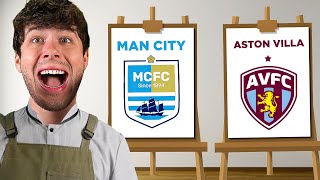
Why not Aston villa
Bit of context for Everton:
The old badge with the yellow was only used for one season and it showed NOTHING about Everton Football Club. There was no motto, it looked hideous on the kits and it was overall just ugly. If they added the motto to the old badge and changed the shape of the crest, it would have been fine. But this caused outrage, and Everton apologised and it got changed to a much better logo. I'm an Everton fan myself, so I'd thought I'd let you know.
I’m a Chelsea fan but I think the number 11 I think that’s how many players they’ve had in that team that did not move teams at all they came to them and stayed
21-3 win for new ones for me. Preferred the new ones for everything except lille, florentina and norwich.
It was the same for me but the ones i prefered the old on were Man City(one of the best logos of all time), Everton and Atalanta(both are weird cases were the change made the logo more complex and crowded instead of the simplified one which i 99% of time prefer).
Loved the content recently yout the best
He’s one of the best TH-camrs
So True!
The old Spurs logo looks like Bayer leverkusen
The amount of work he puts❤❤
Never disappoints
npc comment
@@SuperMullabeanmhm
I will be very thankful
@@SuperMullabean wtf?
sitting down and looking at a bunch of logos isn't hard work. He doesn't even edit his vids anymore. Great content sure, but hardwork? dont make me laugh@@TheCoolFig157
7:39 because it’s how many official trophies won
The old Stuttgart badge looks like a recreation in ms paint xD
5:49 It REE-Mus as in Remus Lupin from Harry Potter. Remus Lupin was based off Remus.
for the leipzig crest on the older one the border is thicker
The lion on the Norwich crest represents the english football system
I'm much to late, but as clubs constantly change their badges I'm just going to say my favourite instead of old v new:
Using Logopedia as my source btw, it's not always perfect but it gives a solid overview
Manchester City: 1997-2016 (the Eagle) - While the modern is the best variation of their old badge, this is just such a powerful look
Lille LOSC: 1989-1997 - I don't mind the current ones as badges as they look nice (2012-2018 in particular) but that is not a mastiff. 1955-1974 is nice but honestly could be any old French club.
Chelsea: 2006-Present - 1905-1952 is fun, but this is clearly best
West Ham United: 1999-2016 - Modern is weak, improved on older
VfB Stuttgart: 1949-1994,2014-present - Same badge, best form
FC Metz: 2000-2021 - Wasn't going to be the modern
Hellas Verona: 1991-1995 - 1999-2020 deserves a shout, but I think this older one has a more clear style
Juventus: 2014-2017 - Not the biggest fan and the 1977-1982 badge is fun, but it feels like the best of the bunch
AS Roma: 2016-Present - Pretty simple, also 1979-1997 is not bad
Tottenham Hotspur: 2006-Present - I think the current badge needs a like something extra but the old badges look dated and the cockerels look weird. 1997-1999 is not badge though
Boca Juniors: 2021-Present - It works, seems to be 40 variations of the same thing, everyone with a different yellow/gold.
Valencia: 1942-1992 - I just like this bat best
Crystal Palace: 2022-Present - The process for deciding this seems to have been the right way to do it. A couple of the alternate suggestions in 2011-12 are nice and 196?-1964 deserves a shout-out.
Paris Saint-Germain: 1996-2002 - I like the balance a bit more modern is solid
Fiorentina: 2003-2022
Bourdeaux: 2001-2020,2021-present - Definitely looks that bit nicer
Norwich City: 1972-2022 - Black border just helps it pop a bit more. That lion needs help though
Barcelona: 2002-Present - Just the colour change to help it pop
Everton: 2014-2021 - Basically the same as its successor, but I think the blue looks nice
Benfica: 1999-Present
Atalanta: 1993-Present
Ajax: 1991-Present - That old one is a bit much
Manchester United: 1998-Present
Juventus went from luxury car brand to newly formed esports team.
Bro should have checked out the old Bayern logo
its gonna be a banger always is
Fr
RB Leipzig's change was the border...
The border has a white outline in the center of the logo
As a Juventus fan, it makes me so mad to see the new logo
The Boca logo stars are supposed to be one for every Primera Division win
Companies have logos, football clubs have crests.
Another banger BFord👍😁😁
The leipzig badge increased its size like caseoh
Like if you agree.
👇🏾
4:23 for mee it looks like a necktie, next to the necktie are two heads of dogs with chinese sereotype beard and over it the words Hellas Verona FC
boca juniors new logo is like over 65 stars
New 21-3 Old, yeah the new was much better by a mile dont know what you meant.
Love u bford keep up the great work❤
There are so many clubs with a new logo . You could make a second and a third
Imagine he showed Bayern's old badge...💀
More like espanyol's logo 💀
Tbh I love the new logos
BFord the crest for the new you see the outline of the soccer ball is in the old one the white shades in
15-15 ( some instances i gave points to both old and new )
For me it was 11-14 and it was a huge comeback by new logos and the old logos almost got back up to first but the last new logos changed that
How did you get 11 - 14 if bford got 14 - 9, there were only 23 points in total, no 25
@@AG7pro there were 24 cause bford drew points on one
Mine was 10-13 but including the RB Leipzig one it would be 11-13
I like most of the new ones more because they look just better but there are a few teams the fucked up the new one 😂
what about Oldest Logos vs Old Logos vs New Logos?
6 - 18
New ones comfortably
15-9 win for new logos
1 Old MCFC logo > New MCFC logo 0 (I like the bird on the old one, the new one looks bland, ordinary)
1 Old Lille LOSC logo < New Lille LOSC logo 1 (The new one looks so much cleaner, plus it looks way better than the old logo)
1 Old Chelsea logo < New Chelsea Logo 2 (How is this even a debate? The new one looks much cleaner + better)
2 Old West Ham logo > New West Ham logo 2 (This was hard, but I like the castle in the old logo, so old logo clears)
2 Old Stuttgart logo < New Stuttgart logo 3 (The new barely changed from the old + they made it look better)
3 Old FC Metz logo > New FC Metz logo 3 (The old one was so good, the new logo removed what was good about the logo)
4 Old Hellas Verona logo > New Hellas Verona logo 3 (It was close for me, but I thought the old was slightly better)
5 Old Juventus logo > New Juventus logo 3 (How is this even a debate? The old one by far without explanation!)
5 Old Roma logo < New Roma logo 4 (Roma barely changed anything from the old the new one and made it look better)
5 Old Tottenham logo < New Tottenham logo 5 (Same with Roma, barely changed anything and made it look better)
5 Old Boca Juniors logo < New Boca Juniors logo 6 (Same with Roma again, barely changed anything but made it look better)
5 Old Valencia logo < New Valencia logo 7 (It was hard, but I like how the wings wrapped around the logo in the new)
5 Old Crystal Palace logo < New Crystal Palace logo 8 (They barely changed anything from the old and made it look better)
5 Old PSG logo < New PSG logo 9 (They barely changed anything from the old logo and made it look a lot better in the new)
6 Old Fiorentina logo > New Fiorentina logo 9 (How is this a debate? The new one looks okay, but the old by far!)
7 Old RB Leipzig logo > New RB Leipzig logo 9 (Even though they look very similar, I like the old slightly more)
8 Old Bordeaux logo > New Bordeaux logo 9 (This was close, but I slightly prefer the old logo more)
9 Old Norwich logo > New Norwich logo 9 (How is this a debate? Old by far!)
9 Old Barcelona logo < New Barcelona logo 10 (They barely changed anything from the old and made it better!)
9 Old Everton logo < New Everton logo 11 (This was hard, but I like the new one slightly more)
9 Old Benfica logo < New Benfica logo 12 (They barely changed anything from the old and made it better!)
9 Old Atalanta logo < New Atalanta logo 13 (They added more to the old logo, and I think it looks better)
9 Old Ajax logo < New Ajax logo 14 (How is this even a debate? New one by far!)
9 Old Manchester United logo < New Manchester United logo 15 (Barely changed anything, but made it look better!)
The Boca juniors changed had three star because of the three club world cups that we won
But the shield with more stars is because all the titles that we won in our history
PLS like if you didn't knew
You are the greatest TH-camr and can you make a Maldini’s son ?
I got 14-9 for the new aswell
Spurs should add the the lion and ribbon to new the badge
the amount of work he puts ❤❤❤❤❤❤
the size got bigger ⚽
Where was Aston Villa?
Do a video on mobile sports apps not just football games
Hellas veronas new logo is just a ladder on statue with two heads🤣🤣🤣😂😂
Hello, as a supporter of FC Metz I can still not get over this new logo, it looks like a damn road sign. Worse, they wanted to erase the dragon (named Graoully, a mythical emblem of the city) from the history of the club. In the opinion of the other fans of L1 we had one of the most beautiful logos of the championship, we now have the worst 🤦♂️
Championship?
@@zachPlushgaming Not the second English league, just the word Championship in French
@kdx4118 yeah I know, thanks for explaining.
I am new and I love you soo much my whole family is subscribed
great vid
A big welcome from Greece!🔥
Bro bford icons as babies
is your next vid going to be about brenford
Wow. There are a lot of logos there that I haven't ever seen in my life.
My scores were:
New 19 - 5 Old
Awsome content man!
Me trying not to pick new logo because I'm used to it
Bford thanks for saying Crystal Palace (My club) is dope 👍🏻
15-8 in favour of new. I don’t know football history well so I never really knew the old logos apart from Everton, Roma and a few others but I certainly like the modern logos better. Perhaps only because I’ve hardly seen old logos so the first time seeing them I am not used to it.
16- 7 To the new badges
For Me
Old : 11
New : 13
Bro fails to entertain us 💀
So here is my list
Manchester City - New
Lille - New
Chelsea - New
West Ham - Old
Stuttgart - New
FC Metz - Old
Hellas Verona - New
Juventus - New
Rome - New
Tottenham Hotspur - New
CABJ - New
Valencia - New
Crystal Palace - New
Paris SG - Old
Fiorentina - Old
RB Leipzig - New
Bordeaux - New
Norwich City - New
Barcelona - New
Everton - New
Benfica - New
Atalanta - Old
Ajax - New
Manchester United - New
Old 5 : 18 New
I apparently just like newer ones, they just give it a touch up to fit with the times mostly, also why do so many people like the old Juventus logo? Not calling out names or anything but I was jus never a fan of it
Good content :)
My score was 17 for new and 6 for old
In Boca i think the stars means how many times they won the championship.
brooo give italy another chance🤣😂🤣😂🤣😂🤣
I miss old Norwich badge
In my opinion new logos on top almost all the new ones are the ones I chose
I love bford
Man city old logo I think is better than current 1
RB Leipzig changed their outline
bford rules
Will you please do orlando pirates if you do career mode
For me, it was new 12-11 old it was very close
I thought the spurs logo was so cool
17-6
As a palace supporter I can confirm the new one is better
WaffleYT313 I just subscribed to your channel because it’s nice to know there are other Crystal Palace fans watching before EAGLES
Thanks
Bford even
That was a great video, 16 - 7 New wins for me!