Absolute golden advice with the X-height! I've had an interest in calligraphy for close to 20 years, which naturally have led me to both look and use many, many different types of fonts and typefaces over the years. I recognized several from the list of "internet agreed timeless" fonts on the list in the video, although I did miss seeing Arial Black on that list, as the lighter weights of that font can also look rather timeless, given you want a more modern rather than classical look (sans-serif over serif). I have though also wanted to make my own, custom, flashy fonts for years (specifically fonts, not typefaces) to use for branding, marketing or project identification, but I've always struggled with the font heights and I couldn't really find any concise rules to follow. That is, until now. Now I know I just need a baseline, an X-height and set a line for ascends and descends at a percentage of the total distance between the baseline and the X-height. Being interested in calligraphy and needing to nerd out on it soon again (haven't done so in years), I will take your challenge with me for training not only my knowledge, but also my ability to write in different typefaces. Thanks for an amazing video!
Skip a weight: That depends how many different weights your typeface has. Recently I worked on a document set in Tahoma, which is a common screen font, not so suitable for type as I found, it takes a lot of space and has only two weights, bold being a lot heavier than regular. I'd have loved to change the whole thing to Myriad (which seems to work nicely for fitting text legibly into limited space and comes with the additional feature of having four widths to choose from) but that would have meant to work for hours on that same technical manual and making sure the text fits nicely in the space between the illustrations on all the pages, in four languages ... so I decided against it, even though I'd never have used Tahoma in the first place ...
a piece of advice I got from Gert Dumbar is to just not use Helvetica. of course, not everyone would agree, but my typography tutor and most other great typographers I know seem to have a similar sentiment. most prefer Akzidenz-Grotesk or some other typeface. I can honestly see why that is, it's kinda like Helvetica, but it seems to me more refined, especially in letterforms like c, t, e, i, and many others. maybe it's really just the ubiquity of Helvetica that kills it to me. or maybe it isn't. the Swiss book "Beauty and the Book" covers 60 years of best swiss books according to The Most Beautiful Swiss Books (a yearly thing based on typography, binding quality, printing quality, etc), and it's set in a Helvetic typeface for sure, but it's not Helvetica for sure as well. If it truly was the Swiss gem many people make it to be, I think the swiss people would be the first to use it on their design books. I guess sometimes they do (e.g. Grid systems in graphic design), but it makes me feel weird that there are so many similar typefaces that I'd have to look really carefully at the type character-by-character to identify whether that's really Helvetica or not, with only tiny differences in width and the "1" glyph that gives it all away. I don't know! I think it's overused. Not my cup of tea. One other note on your video I'd add is that a division between sans serif and serif type is kinda arbitrary. I'd say sans serif is just a type of serif, and the origins of the serif definitely don't come from where you said they do! But either way, I have my two cents to add to the classification conversation. Robert Bringhurst in his book, The Elements of Typographic Style, says that every system of classifying type is deeply flawed, so it's not as clear cut as "serif vs sans serif". I personally subscribe to the model proposed by Gerrit Noordzij, where type is classified on several axes based on the intensity of certain aspects of calligraphic strokes and their weight (e.g. translation + rotation, expansion), and the kind of strokes (e.g. interrupted vs running script, expansion vs translation). The whole premise of the theory set by Noordzij is that all type design is based on individual strokes and not outlines, and therefore can always be reproduced with the right kind of pen. guess it doesn't cover display typefaces but I love that theory! I was really lucky to get my hands on a copy of The Stroke (his book, such a great read! very rare though. The first time I wanted to read it, I had to print and bind it myself because reading out of a pdf on a screen is blergh). If you google "noordzij cube" you can sort of get a better idea of what I mean by a system of axes. The other part of the theory is basically the rest of the book so I won't get into describing it. I guess then on top of that theory one could add origin country or period for the context on the design of the letterforms, and I'd say that is a very effective way of classifying type. It is a bit tedious, though, so even as a big fan of it, I only really get to use it to add specificity in more mainstream classification systems.


This is what I call a perfect video. Succinct and to the point without any fluff. Well done my man!!
There is so much great information in this video!! Thank you for making it!
Your so welcome
Absolute golden advice with the X-height! I've had an interest in calligraphy for close to 20 years, which naturally have led me to both look and use many, many different types of fonts and typefaces over the years. I recognized several from the list of "internet agreed timeless" fonts on the list in the video, although I did miss seeing Arial Black on that list, as the lighter weights of that font can also look rather timeless, given you want a more modern rather than classical look (sans-serif over serif). I have though also wanted to make my own, custom, flashy fonts for years (specifically fonts, not typefaces) to use for branding, marketing or project identification, but I've always struggled with the font heights and I couldn't really find any concise rules to follow. That is, until now. Now I know I just need a baseline, an X-height and set a line for ascends and descends at a percentage of the total distance between the baseline and the X-height.
Being interested in calligraphy and needing to nerd out on it soon again (haven't done so in years), I will take your challenge with me for training not only my knowledge, but also my ability to write in different typefaces. Thanks for an amazing video!
Amazing information in just 10 minutes!
Would love to see more of these 10 minute videos, like a playlist or series!
Power packed value delivered in 10 minutes...... well done
Thank you Jesse !! seriously you deserve moooore subscribers !
I start loving this channel ✨
Thanks for all the typography tips in a short, digestible bite. :)
This was the most helpful video on type… thank you Jesse!!!! Love your channel.
Magnificent teaching 👏🏿
Amazing how much info you were able to condense! I appreciate it as I'm learning more about type
This is one of the best videos I have seen this year. Thank you for making such a great content.
Great video. Concise and packed with useful information. Thanks Jesse.
Wow this is exactly what I needed
Thanks man ❤
Awesome Jesse.
Thanks again, Jesse!
Useful knowledge. Love the video!
lot of information in 10 minutes thanx
So glad you enjoyed it!!!
Thank you 😊
Thank you for this video!
very helpful, thanks
Great video. Thank you
Great video
Kool knowledge sir
Skip a weight: That depends how many different weights your typeface has. Recently I worked on a document set in Tahoma, which is a common screen font, not so suitable for type as I found, it takes a lot of space and has only two weights, bold being a lot heavier than regular. I'd have loved to change the whole thing to Myriad (which seems to work nicely for fitting text legibly into limited space and comes with the additional feature of having four widths to choose from) but that would have meant to work for hours on that same technical manual and making sure the text fits nicely in the space between the illustrations on all the pages, in four languages ... so I decided against it, even though I'd never have used Tahoma in the first place ...
incredible
Please make a video on design system ( complete design system a to z )
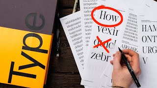
What font type is on your thumbnail that looks like an outline?
Its greaaaaaaat
What software are you using in this video?
It looks like Figma
a piece of advice I got from Gert Dumbar is to just not use Helvetica. of course, not everyone would agree, but my typography tutor and most other great typographers I know seem to have a similar sentiment. most prefer Akzidenz-Grotesk or some other typeface. I can honestly see why that is, it's kinda like Helvetica, but it seems to me more refined, especially in letterforms like c, t, e, i, and many others. maybe it's really just the ubiquity of Helvetica that kills it to me. or maybe it isn't. the Swiss book "Beauty and the Book" covers 60 years of best swiss books according to The Most Beautiful Swiss Books (a yearly thing based on typography, binding quality, printing quality, etc), and it's set in a Helvetic typeface for sure, but it's not Helvetica for sure as well. If it truly was the Swiss gem many people make it to be, I think the swiss people would be the first to use it on their design books. I guess sometimes they do (e.g. Grid systems in graphic design), but it makes me feel weird that there are so many similar typefaces that I'd have to look really carefully at the type character-by-character to identify whether that's really Helvetica or not, with only tiny differences in width and the "1" glyph that gives it all away. I don't know! I think it's overused. Not my cup of tea.
One other note on your video I'd add is that a division between sans serif and serif type is kinda arbitrary. I'd say sans serif is just a type of serif, and the origins of the serif definitely don't come from where you said they do! But either way, I have my two cents to add to the classification conversation. Robert Bringhurst in his book, The Elements of Typographic Style, says that every system of classifying type is deeply flawed, so it's not as clear cut as "serif vs sans serif". I personally subscribe to the model proposed by Gerrit Noordzij, where type is classified on several axes based on the intensity of certain aspects of calligraphic strokes and their weight (e.g. translation + rotation, expansion), and the kind of strokes (e.g. interrupted vs running script, expansion vs translation). The whole premise of the theory set by Noordzij is that all type design is based on individual strokes and not outlines, and therefore can always be reproduced with the right kind of pen. guess it doesn't cover display typefaces but I love that theory! I was really lucky to get my hands on a copy of The Stroke (his book, such a great read! very rare though. The first time I wanted to read it, I had to print and bind it myself because reading out of a pdf on a screen is blergh). If you google "noordzij cube" you can sort of get a better idea of what I mean by a system of axes. The other part of the theory is basically the rest of the book so I won't get into describing it. I guess then on top of that theory one could add origin country or period for the context on the design of the letterforms, and I'd say that is a very effective way of classifying type. It is a bit tedious, though, so even as a big fan of it, I only really get to use it to add specificity in more mainstream classification systems.
👍👍👍
I believe is "Kerning", not "Kearning".
❤❤❤❤❤❤❤❤
Inter is a new timeless font
KEARNING is great!!! So much better than KEMING.
MAN I AM GONNA TURN THOSE USEFUL INFO TO INSTAGRAM POST
that helvetica font not free right ....🥲