Color Wheel Magic: Transforming Images with Photoshop and Color Theory

ฝัง
- เผยแพร่เมื่อ 3 มิ.ย. 2024
- Download the ebook, Color Harmony: Why Hulk Wears Purple Pants, here: www.nucly.com/color-harmony-e...
Ready to unlock Hollywood-grade color magic? → www.nucly.com/color-harmony-s...
In this tutorial, we're going to take 5 images and for each, determine the key color, decide on a harmony and then adjust the colors of the image in Photoshop to achieve our chosen color harmony. In the course of this we'll learn about the color wheel, color theory and how to use a few of the basic color adjustment tools in Photoshop.
00:00 Introduction
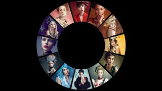
01:05 Color Wheels
02:05 Key Color
03:05 Complementary Harmony
09:32 Split Complementary 1
14:40 Split Complementary 2
21:32 Analogous Harmony
27:48 Triadic Harmony
30:46 Conclusion
Here are the color wheels that I use in the tutorial:
Color Wheel Company - www.amazon.com/Mixing-Artist-...
Grumbacher - www.amazon.com/Grumbacher-Com...
For a full mastery of color in Photoshop as well as professional training on color grading and compositing, check out my Color Grading Masterclass here → www.nucly.com/color-harmony-s...
-
Don’t forget to SUBSCRIBE and turn on notifications! And likes and shares help a lot too!
Check out my full professional Photoshop training courses here: www.nucly.com/courses
And all my asset packs here: www.nucly.com/tools
-
Follow me:
Professional Training - www.nucly.com
Blog - zevendesign.com
Facebook - / zevendesign
Instagram - / zevendesign
500px - 500px.com/rikardrodin - แนวปฏิบัติและการใช้ชีวิต


![[TH] 2024 PMSL SEA GF D3 | Summer | มาร่วมเป็นพยาน กับวินาทีแชมป์!](http://i.ytimg.com/vi/JCYvEsFlwx8/mqdefault.jpg)


Loved this. Thank you!
Wonderful! This was a great tutorial. Thank you!
Finding a great tutorial on this topic is so hard. This video is great for insightful understanding on how to decide and apply colour
Excellent explanation with great examples! Thanx!
Wow. I really needed this tutorial. Thank you 😍
Excellent tutorial on color harmony. A lot of fast and useful information.
I was looking for such tutorial (color scheme to image) for two years!!! Great!
Really helpful, thank you.
Just found your channel and it is absolutely amazing
Very instructive video. Thank you for sharing.
Thanks For Color Harmony Tutorial & Ebook
Awesome video. I just need to learn Photoshop in order to implement the colour harmony.
Amazing Video breaking down colors. Love it
You are doing great work...
He is so serious with his work.. amazing tutorial
Mil gracias por este magnifico video y extraordinaria explicación !!!!
Great job at thoroughly explaining and showing the adjustments you were making on this subj. You just got a new subscriber.
Thank you! Really informative.
This is such a good and practical video. I appreciate you!
Glad you found it helpful Sara!
this is a super tutorial for understanding the colors theory, thank you so much so super smooth video!
That was very useful, thanksssss!!!!!
Thanks for this. Very clear tutorial. I learned a lot.
Thanks Cathryn, very pleased to hear! 😊
Thank you from Russia.
this is crazy. subbed!!!!
Great video and good to see Luis CK doing so well in his new career.
great job..nice information.
Wow I love your way of teaching, you are the best pls how Can I get the colour Eaton circle in my Photoshop like the way you select it
Thank you, a very valuable tutorial! Color is not my strenght.
Thank you
Oh dear ... would love to follow along with the tutorial, but the link for the asset download seems to have disappeared ... can you possibly repost it?
Fantastic tutorial! Do you have any tips or suggestions as to which of the five Color Harmonies you would choose for a given image?
My default is split complementary. For images directed at children or a younger audience, direct complementary is a good option. Where I want something with a more restricted palette, I'll use triadic with the key color predominant and only small touches of the other two. And for an even more restricted palette, I'll use analogous, although I find this color harmony to not be as interesting as split or triadic. But there isn't a hard and fast rule. It's more what you're going for and the look you want to achieve.
Thank you!
Hi, I couldn't find the link to download the 5 images to follow the video. Thanks
Hello great sir... Wasim from pakistan
This is great, have you used 3dLutcreator? if so can you do some tutorials on that? I know there's some really clever stuff you can do inside of that which simply isn't possible in PS. :)
I have. Great program, although I haven't used it enough to do tutorials on it. Yet.
Hi,
Very helpful tutorial as usual... thhank you so much for all the work you are doing to teach us some unique stuffs.
Also, I have the same mic that you have, but my sound is very bad...
Could you tell please, what is the preamp you are using to have this great sound?
(Eventhough I know you are enhancing the sound afterwards)
Thanks in advance
Hey, I'm using a fethead to boost the signal and then an i-Track Solo to convert the audio signal into digital. You can find the fethead here: amzn.to/3OGZ6bk
@@nuclylearn thank you so much for your advices
Fabulous. Very descriptive. One question how does one choose between Hue/Saturation vs Cuves. Practically all options give the same result. Is there a thumb rule to use one over the other
I use Curves 90% of the time and Hue/Sat 10% of the time. Generally, hue/sat works great for targeting a color range and shifting the hue. Curves works great for everything, but takes a little more practice to get good at.
@@nuclylearn Thank you.
I would like to touch on a slightly different aspect of your course. How to avoid boring photos where eg. all pictures of model in yellow dress will always have blue background, because only blue corresponds to yellow? Have you got some tips?
Two suggestions here-the first is to use other harmonies aside from complementary. You can mix yellow and green with analogous. Yellow and red with analogous. Yellow and turquoise or yellow and magenta with triadic and yellow and violet or yellow and cyan with split complementary. The second suggestion is to turn the wheel a bit in either direction. For example, you can push your yellow more toward lime, which will push your complementary toward purple. Or you could push your yellow more toward orange and your complementary more toward aqua. A nice trick for visualization-when you have your color harmony in place, create a hue/saturation adjustment layer with skin tones masked out. Then move the hue slider. This will essentially "turn the color wheel" while keeping your harmony relationships in place.
Amazinhg tutorial. I have a doubt about color wheel. In Phothoshop, the complementary color of green is magenta, but in rulers or guides I read, its complementary color are red. There's some diference?
Yes. Photoshop is simply representing the color spectrum in a circle. A color wheel (often referred to as the "painter's color wheel") is designed to represent color harmony and is slightly different. I would suggest getting one of the color wheels from Amazon that I linked in the subscription. Once you're familiar with using it and it becomes second nature, the Photoshop color wheel (while NOT accurate) will be a visual reminder of the ACTUAL color wheel.
vídeo foda demais!
Amazing!
I've learned so much! Thank you, you are such an amazing communicator. May I ask what is your 'day job'?
I'm a creative director in a design agency. I've been a graphic designer for most of my career.
@@nuclylearn Your professionalism shows through in everything you do. Thank you again.
am new to photoshop, in your libraries you already have color harmonies there. do we have to pay for that to have it downloaded? thanks. sorry noob here.
The ebook is free. Just fill out the form and it'll be added to your library. The Color Grading Masterclass is a paid product. In that course, I go through color harmony in further depth and also teach every color adjustment tool and workflow in Photoshop.
@@nuclylearn oh wow. wicked!!! will take a look into it. thanks Mr. Rodin. i'm mostly take wildlife photos and tend to make a black and white / high key or low key as its easy for me specially when there are lots of bushes. am excited to venture into color areas. cheers. thanks heaps.
The asset link doesn't work. I'm getting a 404 message. Thanks. I enjoy your videos-especially the type effects videos.
This should now be fixed.
how do you select key color based on?
Hey, I cover this here: th-cam.com/video/EV2O0NnWYVc/w-d-xo.htmlsi=YqUU1B1WLH2g3jil&t=144
🙏🇮🇪
To combine colors, you need to use the Eaton circle and not the RGB circle
18:04 here you are effectively changing someone else art work (the background looks like it is some wall painted art) do you ever worry about that is it a thing to worry about? Can it be the same if someone took the photo in front of your photo and then changed your photo in the background while keeping his subject nice and clean in color terms?
Yes I know you are matching the colors and if it is wall art it is public place but again do you ever worry about that, or should you? What if it was some world famous wall artist which is recognizable around the world by his use of colors and you just changed them to match your subject? Where is that line where you don't touch the colors or even paint over and where it is ok to do that?
Very nice explanation 🤌💫💫💫 thanks for this