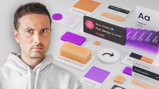
Designing UI Cards That Don't Suck
ฝัง
- เผยแพร่เมื่อ 24 มิ.ย. 2024
- bit.ly/4dJg8jI 👈 Design & code like me. Use "UI2024" for 25% Off!
-- Today, I'm going to show you loads of UI card examples that work and *don't work*. We'll discuss colors, contrast, drop shadows, glows, glassmorphism, flat design, and more..
Woot, let's get started!
#uidesign #uiux
- - - - - - - - - - - - - - - - - - - - - -
Subscribe for NEW VIDEOS!
Learn UI/UX: designcourse.com
My personal FB account: logodesigner
Coursetro FB: coursetro
Coursetro's Twitter: / designcoursecom
Join my Discord! / discord
^-Chat with me and others
- - - - - - - - - - - - - - - - - - - - - -
Who is Gary Simon? Well, I'm a full stack developer with 2+ decades experience and I teach people how to design and code. I've created around 100+ courses for big brands like LinkedIn, Lynda.com, Pluralsight and Envato Network.
Now, I focus all of my time and energy on this channel and my website Designcourse.com.
Come to my discord server or add me on social media and say Hi! - แนวปฏิบัติและการใช้ชีวิต


Framer course is getting close to finished! Take it today for 40% off! Code FIGMATOFRAMER designcourse.com/figma-to-framer
Most industry videos are one big philosophy and half of a video is often an advertisement for courses, not a video from which you can learn something. Here is a reliable, accurate and quick presentation, thanks for the video!
You're right... Big techs use minimal design which is easy on the eye and easy to use....
Ey, a perfect answer to a question I had some weeks ago. Thanks a lot for this Simon, and always awesome to see the reminder that function > aesthetic.
i liked the purple shadow on black background :)
Theres always a struggle between artistic visions and standard designs imho
Thanks for showing us so many variations with the right approach. Loved it... 💙
Quality content right there 👍
Although I like most of these designs I would need to run them thorough WCAG/ADA testing to ensure the contrast is correct and allowed. Some of the transparent ones I think would not pass. And 99.99% of the designs I do require this.
well this was awesome. Thanks!
I'm struggling with implementing these within Framer's CMS. Like, I want these things to contain content from the CMS, but I also want these things to be embedded into the article when needed, like a toggle. Imagine a blog about trading cards or NFT's or real estate, all of these need 'cards' of some kind that can be inserted into a blog (like in between two paragraphs) for them to feel truly interactive.
I agree with almost everything said in the video. Great lesson! 👍
Wow 🤩 🚀 thanks
Thanks but what about spacing, font sizes, order of elements...
that's more of a typography lesson, though at its entirety you basically just want to adhere to the hierarchy rule and points of emphasis like buttons, images etc
Hey Simon,I wanted to know your opinion on AI taking over graphic design/web design, I seen a recent youtube video of a guy losing his job,is this the future for this career path?