heatmap in R: Tutorial 10-Heatmap, Data Visualization using R , GGplot2, data correlation

ฝัง
- เผยแพร่เมื่อ 26 ก.ย. 2024
- #heatmap #ggplot2 #datavisulisation #correlation
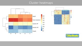
Visualization of correlation using heatmap.
This session demonstrates how to plot to visualize the correlation between variables using ggplot2. Other correlation visualizations are not suitable when the number of observations being plotted is very large. Overlap prevents the display of correlation. Heatmap is very effective method to overcome this problem.
Heatmap visualise the magnitude of values using proportional intensities and hues of colors.
The following code is used in the tutorial.
drive.google.c...


Excellent video. Very well explained in simple words n simple steps. Keep making such good videos. Im looking forward to learn . 🙂
Thanks for appreciation.
Thank you so much sir. You are helping a lot for my PhD
Glad to hear that. Thanks
Nice representation of bulk data.
May be people will update their knowledge on R program Instead of using routine data analysis tools in Excel/Origin.
Congratulations.
Thanks for appreciation.
Thank you sir. It was very helpful
Glad, you liked it. Thanks for the response. Please watch and like other videos also.
Great videos sir ❤️🙌
So nice of you
I ran the same command, however, it doesn't generate the row numbers in the matrix form as explained at 3:12
These are row numbers of the matrix. Send me the code which you are running?
Thank you for the video! Why did you use 256 with the terrain colors and 25 with the RColorBrewer?
That was arbitrary choice. You choose colors as per your levels and resolution of colors you need . More colors are confusing but if the number of levels is very high , a large number of colors helps.
Excelente !!!
Thank you very much. Please share with your friends.
Sir Can you please let me know how we can add scale of expression in heatmap
Is there any way to find out the list of genes in a cluster?
Thank you very much sir for this useful video. Please, can you provide a code to generate the clusters in an excel file or CSV? I will really appreciate. Thanks once again.
I will give you the code soon.
@@DevResearch thank you for your reply. I will expect the code. Many thanks
Sr why everyone don't share high resolution save (heatmap) ?
Plz help me
png("heatmap.png", width = 1700,height = 1700)
heatmap(as.matrix(iris[1:4]),scale="column",cexRow = 2,cexCol = 2)
dev.off()
Increased resolution as height and width, results in reduced size of text. Use cex=2 or 3 to make text size suitable for the size.
@@DevResearch thank you thank you very much . Its worked ❤️❤️🌹
How can I make a two-dimensional correlation heatmap in r studio.
cor_val
@@DevResearch As a result of the analysis, there is no legend in the heatmap. How can I create it.
@@hakankibar5421
library("pheatmap")
pheatmap(scale(mtcars), cutree_rows = 4)
@@DevResearch Thank you
very well explained sir thank u
Thanks a lot for appreciation. Please share with your friends.
@@DevResearch sure if u share ur mail id it will be easy for me to clear my doubts
Thanks for appreciation. Please share with your friends.
Could you please teach how to annotation in both row and column?
Yes I will. Very soon will do that.
Dear Dr, i would like to ask how can i include p-value in each cell ?
Each cell of heatmap?
@@DevResearch each case in the map
Yes. If you have matrix of p values of correlations, you can use geom tiles. And using label mapped to p values, can have geom text.
x
Sir, how to add legend for the Heat map? please provide code for add the legend
df=as.matrix(mtcars)
#2. Now plot heatmap.
heatmap(df)
#4. You can scale it to normalise data
heatmap(df, scale="column", Colv=NA)
# Plot a corresponding legend
legend(x="topright",
y= "top", legend=c("min", "med", "max"),fill=heat.colors(3))
Try above one. I tried this on my android phone. If yiu need more sophisticated approach using other packages, lete know.
Nice Rajendra. I have another question that is related to ggmsa. can you please help me. Thanks
It's a visulisation package. Needs alignment file in fasta format. Can customise color scheme and fonts. Can be combined with tree. Is there any other specific thing you want?
@@DevResearch hi Rajendra hi. Thanks. Yes, I do have something specific. Can I send you an email. My email is singhka@missouri.edu. Thanks- Kamal
Yes please mail me. My id is rajuchoure@gmail.com.
@@DevResearch Rajendra JI, I just sent you an email from my work account. Thank you very much for your help.