Media query introduction - Part 1

ฝัง
- เผยแพร่เมื่อ 21 ก.ย. 2024
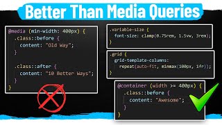
- Media queries! Media queries are a fundamental part of responsive web design, allowing you to apply CSS rules based on the characteristics of the device or viewport displaying the content.
Syntax
The basic syntax of a media query looks like this:
@media (condition) {
/* CSS rules here */
}
@media (max-width: 600px) {
/* Styles for screens less than or equal to 600px wide */
}