How To Easily Insert Python Charts Into Excel

аёқаёұаёҮ
- а№Җаёңаёўа№ҒаёһаёЈа№Ҳа№ҖаёЎаё·а№Ҳаёӯ 23 аё•.аё„. 2021
- рҹ‘ү Explore All My Excel Solutions: pythonandvba.com/solutions
рқ——рқ—ҳрқ—Ұрқ—–рқ—Ҙрқ—ңрқ—Јрқ—§рқ—ңрқ—ўрқ—Ў
в–Җв–Җв–Җв–Җв–Җв–Җв–Җв–Җв–Җв–Җв–Җв–Җв–Җв–Җв–Җв–Җв–Җв–Җв–Җв–Җв–Җв–Җв–Җв–Җв–Җв–Җ
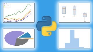
If you are an Excel user then you might have encountered the limitations to do some really cool stuff that requires Python. But no need to worry, now with xlwings, you can run Python code in Excel without any difficulty at all. In this video, I'm going to show you how to easily insert Python charts into Excel and generate professional data visualizations for your work using xlwings.
в–¶ Download the Jupyter Notebook & Excel File here: github.com/Sven-Bo/python-cha...
рқ—§рқ—ўрқ—ўрқ—ҹрқ—Ұ рқ—”рқ—Ўрқ—— рқ—Ҙрқ—ҳрқ—Ұрқ—ўрқ—Ёрқ—Ҙрқ—–рқ—ҳрқ—Ұ
в–Җв–Җв–Җв–Җв–Җв–Җв–Җв–Җв–Җв–Җв–Җв–Җв–Җв–Җв–Җв–Җв–Җв–Җв–Җв–Җв–Җв–Җв–Җв–Җв–Җв–Җ
рҹҶ“гҖҗрқ—ҷрқ—Ҙрқ—ҳрқ—ҳгҖ‘Excel Add-in (рқ— рқҳҶрқ—§рқ—јрқ—јрқ—№рқ—•рқ—Ірқ—№рқҳҒ): pythonandvba.com/mytoolbelt
рҹ“Ҡ Data Visualization Excel Add-In (рқ—ҡрқ—ҝрқ—®рқ—ірқ—№рқҳҶ): pythonandvba.com/grafly
рҹӨӘ Fun Emoji Excel Add-In (рқ—ҳрқ—әрқ—јрқ—·рқ—¶рқ—ірқҳҶ): pythonandvba.com/emojify
рҹ“‘ Excel Templates: pythonandvba.com/go/excel-tem...
рҹҺ“ My Courses: pythonandvba.com/go/courses
рҹ“ҡ Books, Tools, and More: pythonandvba.com/resources
рқ—–рқ—ўрқ—Ўрқ—Ўрқ—ҳрқ—–рқ—§ рқ—Әрқ—ңрқ—§рқ—ӣ рқ— рқ—ҳ
в–Җв–Җв–Җв–Җв–Җв–Җв–Җв–Җв–Җв–Җв–Җв–Җв–Җв–Җв–Җв–Җв–Җв–Җв–Җв–Җв–Җв–Җв–Җв–Җв–Җв–Җ
рҹ”— LinkedIn: / sven-bosau
рҹ“ё Instagram: / codingisfun_official
рҹ’» GitHub: github.com/Sven-Bo
рҹ’¬ Discord: pythonandvba.com/discord
рҹ“¬ Contact: pythonandvba.com/contact
вҳ• рқ—•рқҳӮрқҳҶ рқ—әрқ—І рқ—® рқ—°рқ—јрқ—ірқ—ірқ—Ірқ—І?
If you want to support this channel, you can buy me a coffee here: pythonandvba.com/coffee-donation


*I will be here in the comments section. For any issues, please provide your exact error message, and I will try to help.*
Thank you for making such content, which is really clear and easy to follow. It is even more the case with Jupiter Notebook . I enjoyed all your videos !
I look forward to your next videos рҹҷҢ
I am thrilled to hear that. Thanks for watching the videos and taking the time to leave a comment - I appreciate it! :)
Many thanks for such a great video as usual, you summarized all the plotting needed for Python in one video
Loved it and I learned a new information about pandas plot that we should export its figure before passing it to the excel рҹ‘Қрҹ‘Қрҹ‘Қ
Glad you enjoyed this video too. As always, I am very happy about all your comments & support! Thank you very much! :)
Excellent clear tutorial. Thanks
Thanks for watching and your comment! :)
Excellent video.
Really well explained and illustrated with great visuals.
New Sub !
Thanks for the sub! Welcome aboard! рҹҺү
Very nice resource. Thank you!
Glad you liked it. Thanks for watching and taking the time to leave a comment! :)
Interesting video. At the moment IвҖҷm experimenting with excel charts. The video came for the right time. And IвҖҷm interested in the mplfinance video.
Good timing then :) Thanks for watching the video & your comment рҹҳғ
Great job again!
Thank you! рҹ‘Қ
Your knowleadge Is good on Python and Excel. I try to lean It on your ytchanel thanks for share It.
Thank you! :)
Fascinating content.
Is it possible to make a selection in one chart and use that as a filter in all the other charts?
Could you create a scatter chart with a separate data frame below it with the detail transactions below it.
Can you select a number of points within the scatter chart and then have the data frame dynamically filter to show only the details for those points selected?
Thanks for watching. Glad you like the video.
a) Is it possible to make a selection in one chart and use that as a filter in all the other charts? -> No, as those are static images
b) Could you create a scatter chart with a separate data frame below it with the detail transactions below it. -> That is certainly possible
c) Can you select a number of points within the scatter chart and then have the data frame dynamically filter to show only the details for those points selected? -> No, as those are static images
Hi, many thanks for the great video! One question : if I try to insert a few matplotlib plots one by one by use sht. pictures. add with the different ranges, it does not work. First plot is replaced by second one and so on. How to resolve this problem? Thank you very much in advance!
Thanks for watching. It depends on what you are trying to achieve. You could either set "update" to "False" or just use different names:
CHART 1
sht.pictures.add(
fig,
name="Chart1",
update=True,
left=sht.range("A4").left,
top=sht.range("A4").top,
height=200,
width=300,
)
CHART 2
sht.pictures.add(
fig,
name="Chart2",
update=True,
left=sht.range("A20").left,
top=sht.range("A20").top,
height=200,
width=300,
)
@@CodingIsFun Super! It works! Many thanks for the instant answer!)
Hi thanks for greate job, Question is possible in pyecharts calendar add the day nunber on each moth.
Thanks! Are you referring to the following video? th-cam.com/video/xE95tIzCuKM/w-d-xo.html
Intuitively, I am not sure if that is possible. I would also need the search the internet to find that out ;)
@@CodingIsFun yes my friend.
Can we edit the x axis and y axis range manually in excel after generating the excel file by python?
Thanks for watching. You can edit your data in Excel, but you would need to rerender your chart again (as it is an static image)
Thank you for this informative video. Is there a way of exporting a chart from an excel sheet using xlwings?
Thanks for watching. Do you mean a native Excel chart?
@@CodingIsFun Yes, a native chart generated in Excel. I have a spreadsheet that has a chart and I want a way to grab the chart and save it as a PNG or export it directly to a word document.
Thank you for responding.
@@lazolabucwa8821 You would need to use the underlying module 'pywin32' to achieve something like this. Have a look at the response on StackOverflow from Felix, the creator of xlwings, to a similar question: stackoverflow.com/a/41363216
I hope it helps! Happy Coding!
This is powerful, arcane knowledge... imagine if average users knew! рҹ‘Ҫрҹӣё
рҹҡҖрҹҡҖрҹҡҖ
Hello , thank you for this video but i have a question , I try to insert another graph but on the right side of the first graph (horizontally) but the code deletes the first graph and replaces it with the second (knowing that I have changed the cell for top and left for the second graph . Can you help me please ???
рҹҷҸрҹҷҸ
Thanks for watching. It is explained at 3:05 min ..
Hello mate, I have learned a great skill from your video, but I got a question about:
What i can do if i want add multiple charts insertion into excel , while there are multiple datasets here
Thanks! Happy to hear that.
Regarding your questions: The same logic applies. Please try it out. Thanks!
Thanks for video! Really good tips for inserting plots to Excel.
Is it possible insert editable plots? Not as a pictures.
Thanks for watching. This is only possible with Excel native charts: docs.xlwings.org/en/stable/api.html#xlwings.Chart
вҖӢ@@CodingIsFun Hi. I found decision for inserting editable chart to excel. It's xlsxwriter module. It seems like a VBA a bit, but it's not bad for this task.
@@nikitaandronnikov4088 Yep, xlsxwriter is also using Excel native charts
Can we make excel just like streamlit, adding multiselect option and Interactive KPI metric by only using python ?
There are some possibilities. I would suggest checking out all my xlwings tutorials on my channel. There are many examples of combining Python and Excel (also using Drop Down menus)
Does the plotly chart maintain the interact ability in excel too?
Thanks for watching. Nope, it doesn't. It will be a static image
if i want to use an existing excel file, can use the direction of that file on my pc? or how could i use it?
You could insert the xlwings VBA module into your existing file. Check out this video on how to do it: th-cam.com/video/iIATJtruZBE/w-d-xo.html
Hello. Regards from argentina. Can I do some interactive plots and copy them to an excel or power point slide without loosing the interactive traits of the graph? Thank you
Thanks for watching. To my knowledge, this is not possible in Excel. For PowerPoint I have not tried, but I found the following: answers.microsoft.com/en-us/msoffice/forum/all/importing-html-objects-into-powerpoint/43ffc6ec-87ed-47c5-b4c0-99b76945a975
@@CodingIsFun Thanks for your response and your time.
How would you insert the plots into a new sheet of an already-existing Excel file?
Here you are: docs.xlwings.org/en/stable/connect_to_workbook.html
I hope it helps! Happy Coding!
Hi thanks for your great information.
The address for dataframe doesn't work is it possible to check . Thanks рҹ‘Қ
What exactly do you mean? Do you get an error message? The dataframe will be created once you execute the macro/button in the workbook. Thanks!
@@CodingIsFun And also I got error in .font attribute for range .
@@sadegh333 Please use the latest version of xlwings: pip install xlwings --upgrade
Please make a video on the mplfinance library!
Thanks for watching the video and your comment! :)
can i use openpyxl instead of xlwings as i'm having an error with it ??
With openpyxl you can insert Excel native charts:
openpyxl.readthedocs.io/en/stable/charts/introduction.html
@@CodingIsFun thank you so much for replying i'm really enjoying your videos and learning alot
Keep up the great work. Great video. Can you create a video on how open a specific file in a directory based on the data on 3 cells. Example I have invoice number 12345 on cell C1 and I have account number on A1 and service master on B1. I want to access the pdf file for invoice 12345.pdf that is located on the F drive with the path ServiceInvoices/Account#/ServiceMaster/12345.pdf. The program will prompt the user enter invoice number, after the user enters the invoice number the program will open the pdf file on chrome or adobe reader. Or maybe you can hyperlink the path into this program in order for the user to open the invoice.pdf file at any time tha they want. I think this will be great for small business that have many invoices but need a way to organize their invoices.
Thanks for watching the video & your suggestion. I have created a dedicated video for you and uploaded the source code on GitHub:
Video: th-cam.com/video/V3Csrk--laM/w-d-xo.html
Source Code: github.com/Sven-Bo/create_invoice_filepath
I hope this will be a good starting point for you. Happy coding! рҹҳғ
Thank you.
I keep getting error while using Plotly, I installed all packages : request kaleido psutil: , its giving me error called
ValueError:
""" Image export using the "kaleido" engine requires the kaleido package,
which can be installed using pip:
$ pip install -U kaleido"""
You might be executing the Python code from a different virtual environment (in which you do not have installed those packages).
Yes please on the mplfinance video
Thanks for watching the video & your comment :)
What do i do? I didn't get the 4-bar chart like yours in the Panda chart. I got millions of bars instead. Also the ploty gave me an empty image :(
So, if you run the exact code from my GitHub repo you got different charts?
@@CodingIsFun yes. I copied exactly from your code. I have updated and installed all the libraries.
@@winntospol6752 That's interesting. Unfortunately, I do not know what the issue could be.
@@CodingIsFun I'll try to figure out later then. Thank you so much for your reply and the good video.
@@winntospol6752 did you fugure it out? I am having same problem.
In sht.pictures.add(fig,name=xyz, .......) i am giving its giving name not defined .There is no mention of how to give name .I did like name=None,update=False then it worked.Also its giving error after insert heading "Range object has not attribute 'font' .At end xls name is getting changed but not getting closed with wb.close
Thanks for watching. Unfortunately, with that bit of information, I cannot help you. You might want to take some time to write down which line of code is causing the error; let me know if you have modified the code from the tutorial, explain in more depth what you did to troubleshoot the problem and provide some more context. Thanks!
i we want the charts inserted in excel be interactive, how can this be accomplished ?
Thanks for watching. That is not possible
Great
Glad you liked it! рҹ‘Қ
How to hide and show in Jupyter notebook code?
You can install the' jupyter nbextensions configurator' (stackoverflow.com/a/42056357)
pip install jupyter_nbextensions_configurator
jupyter nbextensions_configurator enable --user
No. 9 in the following list: medium.com/@maxtingle/10-jupyter-notebook-extensions-making-my-lyfe-easier-f40139a334ce
I hope this helps!
:( not updated in excel why ?
Thanks for watching. Unfortunately, with that bit of information, I cannot help you. You might want to take some time to write down which line of code is causing the error; let me know if you have modified the code from the tutorial, explain in more depth what you did to troubleshoot the problem and provide some more context. Thanks!
вҖӢ@@CodingIsFun first, Thank you very much for your valuable time and effort to deliver such amazing tutorials, highly appreciate . this video really helpful for me.
code i have type
sht.pictures.add(
fig,
name = "SDENTL >= 45",
update=True,
left=sht.range("A4").left,
top=sht.range("A4").top,
height=200,
width=300,
)
result - no any error successfully executed but itll not copy to the excel
output
@@dhanushkamadhusanka683 How about trying to debug your code? You could start by changing the name. Instead of "SDENTL >= 45", try "test".
@@CodingIsFun- Issue sorted ,again i have missed some codes... once again, Thank you Sir..
Cool,How to insert Plotly chart into excel by Pycharm,thanks!
The same way as shown in the video. It does not matter which text editor or IDE you are using. How about you just clone the GitHub repo and give it a try. Thanks!
pandas chart is all messed up. I used your github repo ipynb
What do you mean by messed up?
@@CodingIsFun What do i do? I didn't get the 4-bar chart like yours in the Panda chart. I got millions of bars instead. Also the ploty gave me an empty image :( yes. I copied exactly from your code. I have updated and installed all the libraries.
@@akzork, I just fixed it. Please pull it again from GitHub:
www.screencast.com/t/WErQyX1rS4
@@CodingIsFun thank you !
wow
Thank you!
First of all thank you so much for the tutorial.
Doubt:
rng.font is not working to customize my headings in the jupyter notebook
Thanks for watching. Unfortunately, with that bit of information, I cannot help you. You might want to take some time to write down which line of code is causing the error; let me know if you have modified the code from the tutorial, explain in more depth what you did to troubleshoot the problem and provide some more context. Thanks!
dein Akzent ist so putzigрҹҳӯрҹҳӯ
Danke рҹҳ…
Getting this error : XlwingsError: Your platform only supports the instantiation via xw.Book(json=...)
If you are using Linux, xlwings won't work.
---------------------------------------------------------------------------
NameError Traceback (most recent call last)
Input In [139], in ()
----> 1 insert_heading(sht.range("A2"), "Matplotlib Chart")
NameError: name 'insert_heading' is not defined
Looks like you missed to define the function 'insert heading' as shown in the video
@@CodingIsFun first, Thank you very much for your valuable time and effort to deliver such amazing tutorials, highly appreciate . this video really helpful for me
yes , you are correct, i have missed to define it.. again , thank you very much.рҹҷӮ