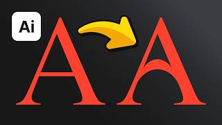
Draw Blending Logo in Adobe Illustrator. Logo Modernism Ep01: Tokyo Advertising
ฝัง
- เผยแพร่เมื่อ 1 ส.ค. 2021
- Logo Modernism Ep01. In this episode, I draw Tokyo Advertising logo by Kazumasa Nagai made in 1966 located on page 124 of the book. This is a tutorial video to help you understand how you can design great logos that stand the test of time.
Buy the book: www.taschen.com/pages/en/cata...
Follow me: / kassymkulov
My website: kassymkulov.com
Music: www.bensound.com


Short yet amazing.. Thanks for the tutorial. This would be a great series
wow! Nice
You're amazing man. Your work is amazing. It would be really great to have your videos to learn from
Awesome
Awesome ✨ your tips
Thank you so much for epsode. Please continue this ep.
Thanks. Glad you like it.
Amazing Series Thanks
nice and great
Awesome series!
Thanks. Glad you like it.
Idk why but when I use blend tool, my lines appear distorted and uneven
It all depends how you rounded the corners of outer shape. You can also try simplifying curves so that there’s less points.