I have been watching your videos for a month now, the way your cover and explain these concepts allowed me to unlock things that I previously struggle with for a loooong time. Man I’m so grateful for the content you put out ! Thank you so much Tim !
Wow, what an impact that a minimal amount of color can have! I've always loved the sepia monochromatic color palettes but never knew the color theory behind it. Thank you so much, your work is breathtaking! ❤
The more I learn about color theory, the more I marvel how I got anything done before. And the more I understand why I didn’t understand people who could arrange flowers or do interior design. And most especially, I had no idea the VITAL role it plays in video and photo production. I know. Writing that now, I’m embarrassed I’ll be read and judged. But it’s true and I’m so glad for these videos that rapidly correct what I’ve spent years crumpling and scratching.
No, I don't think it's that strange. I have never understood why flower arrangement and interior design worked, but WOW DO THEY WORK.... Art is always like this: it seems easy when done right, and it's so so difficult to get to that point 😂😂😂
I’ve been binge watching your videos the last few weeks and not only are your videos relaxing to draw along to, but I’ve learned so much! I hope you keep making awesome content cause I don’t know what I’d do without your channel as my art ritual now!
that vibrancy you talk about makes me think about music. two notes might sound weird together but as soon as you add in that "magical" third note and everyone is lining up to buy your album!
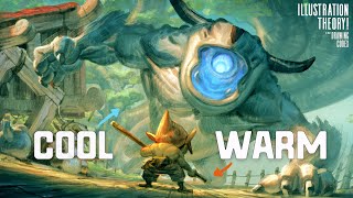
Thank you so much for the Video Tim! 😃 really informative and clear, I think I will have to get one of the color wheels for myself haha. I do have one questions relating to the colour scheme you had for the forest scene at 21:24, what if the character design were to have the cape in red, but you still want the focus to be on the dragons, would you desaturate the red so it has less focus? What would your approach be then?
I feel the description was a bit hard to follow a bit. There was a lot of, 'It just is' kind of mentality. lol One thing that I might suggest to help, maybe explain it with the textures of the image in mind, because I have tried to implement color stuff, using fancy color wheels and what not, but it never really seems to work. So maybe diving bit deeper in the understanding of how to use these colors with a color temperature and texture might really help me understand it a bit. Because I look at your images, which are great, and I think to all the times I have done coloring, which is not often due to my struggle with it. and using the same color scheme you use I still don't get anywhere near the results I'm trying to get. Color is one of my biggest cruxes with art... and every time I finish an image and then think to add color I am struck with intense anxiety because the things I have attempted to color in the past... fell apart SOOO fast... And this was back before I learned how to use Layers... so many of deleted art pieces...
The beginning of this comment was some pretty good constructive criticism for how to explain the theory, but by the end you were just venting your frustrations on him. I don’t think that’s really fair. I hope you get where you want to go with your art but a another person’s TH-cam video comment section doesn’t sound like the place to be sad at them.
Look up Lighting Mentor on TH-cam and do the color studies he talks about. They may not be as fun as the imaginative paintings you want to do, but if you start understanding how color works from observation-- not just learning to copy, but understanding how the color you see is created and how it shifts as it wraps around the form-- it'll make it easier to work from imagination.
I love your tutorials and your art talks. It contains so much useful information that I can use. I have a question how do you deal with stagnation in art, where it seems you are not improving in spite of all the exercises/ practices done and just getting frustrated with it all.
When you said "do you even need a color?" it immidiately struck me. Some composer when they compose a symphony they don't know yet which part will be played by horns, tubes, or some fancy instruments. They set every melody to be played by strings(or a piano). (a musical equivalent of using monochrome) and then they "add color" by checking out if an arranging this or that music part to be played by horns or whatever. So, start minimalistically. LIke first movies by Scorsese or Darren Aronofsky. No color. Focus Light and shadow. Then MAYBE add color. One color? Two colors? I'll reverse the saying: Limit is your imagination. (not: imagination is your limit)
don't take this the wrong way but, please, learn english, it's not that hard and it's very useful. Te lo dice un latino que aprendió inglés viendo south park
@@matyhoppus4842 Que uses google translator para escribir no hace que sepas ingles, vos pensas que pedir que abran su trabajo a una audiencia mas grande es solo por mi comodidad? Por favor, aprende a abrir tu mente, te lo dice alguien que aprendió viendo todo lo que existe en múltiples lenguajes en el mundo. Suerte con esa búsqueda de sabiduría. Menos soberbia cachorro.
For example is ok. But i find these colors quite primitive: green trees with green tones, little bit yellow and blue. Nature is more colorful and strange that artist like you cannot see these colors... trees are contain out of more shades and grass...
To save your time he just says look at this green forest. What color should a forest be? Green. Grass? Green. I'm pretty sure this is not a real human. This guy is AI generated


I have been watching your videos for a month now, the way your cover and explain these concepts allowed me to unlock things that I previously struggle with for a loooong time. Man I’m so grateful for the content you put out ! Thank you so much Tim !
Wow, what an impact that a minimal amount of color can have! I've always loved the sepia monochromatic color palettes but never knew the color theory behind it. Thank you so much, your work is breathtaking! ❤
This made so much sense to me. Use what is simple! Thank you.
The more I learn about color theory, the more I marvel how I got anything done before. And the more I understand why I didn’t understand people who could arrange flowers or do interior design. And most especially, I had no idea the VITAL role it plays in video and photo production.
I know. Writing that now, I’m embarrassed I’ll be read and judged. But it’s true and I’m so glad for these videos that rapidly correct what I’ve spent years crumpling and scratching.
No, I don't think it's that strange. I have never understood why flower arrangement and interior design worked, but WOW DO THEY WORK.... Art is always like this: it seems easy when done right, and it's so so difficult to get to that point 😂😂😂
I’ve been binge watching your videos the last few weeks and not only are your videos relaxing to draw along to, but I’ve learned so much! I hope you keep making awesome content cause I don’t know what I’d do without your channel as my art ritual now!
I'm a senior year student in comics in belgium and your videos are always awesome. It's always useful !
Gratitude for this class
that vibrancy you talk about makes me think about music. two notes might sound weird together but as soon as you add in that "magical" third note and everyone is lining up to buy your album!
I love your use of colour in particular, so this video was great!
Tim, I was just gifted a membership into the drawing codex! I can’t wait to get started.
This colour business is sorely lacking in my painting - so I appreciate your input so much - thank you
I painted my whole house with these 3 colors, much better than backpaint.
Awesome color wheel with the grayed colors!
Nice video. Honestly this is one part of painting I have been struggling with.
I appreciate your expert perspective. It helps me grasp the concepts better for my program.
Great explanation of how simple it can be. Thank you for sharing your expertise!
Man your videos are so amazing and easy to follow. Thank you so much for all the info 🙏
Awesomeness sir
I hope you do a video on how pink and olive work as a palette.
Thank you so much for the Video Tim! 😃 really informative and clear, I think I will have to get one of the color wheels for myself haha.
I do have one questions relating to the colour scheme you had for the forest scene at 21:24, what if the character design were to have the cape in red, but you still want the focus to be on the dragons, would you desaturate the red so it has less focus? What would your approach be then?
I feel the description was a bit hard to follow a bit. There was a lot of, 'It just is' kind of mentality. lol One thing that I might suggest to help, maybe explain it with the textures of the image in mind, because I have tried to implement color stuff, using fancy color wheels and what not, but it never really seems to work. So maybe diving bit deeper in the understanding of how to use these colors with a color temperature and texture might really help me understand it a bit. Because I look at your images, which are great, and I think to all the times I have done coloring, which is not often due to my struggle with it. and using the same color scheme you use I still don't get anywhere near the results I'm trying to get. Color is one of my biggest cruxes with art... and every time I finish an image and then think to add color I am struck with intense anxiety because the things I have attempted to color in the past... fell apart SOOO fast... And this was back before I learned how to use Layers... so many of deleted art pieces...
The beginning of this comment was some pretty good constructive criticism for how to explain the theory, but by the end you were just venting your frustrations on him. I don’t think that’s really fair. I hope you get where you want to go with your art but a another person’s TH-cam video comment section doesn’t sound like the place to be sad at them.
Look up Lighting Mentor on TH-cam and do the color studies he talks about. They may not be as fun as the imaginative paintings you want to do, but if you start understanding how color works from observation-- not just learning to copy, but understanding how the color you see is created and how it shifts as it wraps around the form-- it'll make it easier to work from imagination.
I'm just now finding out about this book, the Pinocchio retelling you illustrated, and it's gorgeous! But I can't find it anywhere! :(
Oh yeah? It might be hard to find I haven't tried looking lately. That sucks
Just what I needed I could sketch all I want but can't follow solid color plan
Thank you for this 😊
Finally, a new video 😀. Love English accents with art studies
This dude isn't English.
I didnt expect to be taught color theory by obi wan today. a surprise for sure, but a welcome one
Thank you!
I love your tutorials and your art talks. It contains so much useful information that I can use. I have a question how do you deal with stagnation in art, where it seems you are not improving in spite of all the exercises/ practices done and just getting frustrated with it all.
Wow, these are great tips! I always had issues with color but now it seems less daunting after your explanation
So good, My friend!
what drawing pen display is that you are using? Iam thinking of gettign one and its down to two.. thanks for the video...
Love your work!
Awesome info man.
Thanks for another awesome video!! My son & I both enjoy your videos! :D
very helpful, thanks
Much appreciated! Beautiful work!
Hello. Where did you buy the color wheel? Thank you
When Can I get that color wheel?
Thanks, GOD bless you.
You are the best! Thank you so much.
good advice
Amazing video ❤
I cant seem to find a color wheel like that
Subscribed!
When you said "do you even need a color?" it immidiately struck me. Some composer when they compose a symphony they don't know yet which part will be played by horns, tubes, or some fancy instruments. They set every melody to be played by strings(or a piano). (a musical equivalent of using monochrome) and then they "add color" by checking out if an arranging this or that music part to be played by horns or whatever.
So, start minimalistically. LIke first movies by Scorsese or Darren Aronofsky. No color. Focus Light and shadow. Then MAYBE add color. One color? Two colors?
I'll reverse the saying:
Limit is your imagination.
(not: imagination is your limit)
Colours really screw with me when im trying draw from photos its always so much greyer than i think
I have the theory, but I have a extremely difficult in applying this in a illustration.
My walls were so bland before but now they sing!
the woman drawing is so cool
Any blank wheel exisr
Why TH-cam does not notified me of your videos i even turned on
3:00
Cool accent, Its like 90% Aussie, 10% American
Please, subtitule in spanish your work.
don't take this the wrong way but, please, learn english, it's not that hard and it's very useful. Te lo dice un latino que aprendió inglés viendo south park
@@matyhoppus4842 Que uses google translator para escribir no hace que sepas ingles, vos pensas que pedir que abran su trabajo a una audiencia mas grande es solo por mi comodidad? Por favor, aprende a abrir tu mente, te lo dice alguien que aprendió viendo todo lo que existe en múltiples lenguajes en el mundo. Suerte con esa búsqueda de sabiduría. Menos soberbia cachorro.
For example is ok.
But i find these colors quite primitive: green trees with green tones, little bit yellow and blue.
Nature is more colorful and strange that artist like you cannot see these colors... trees are contain out of more shades and grass...
Can you do a centar, Wolves, Ghosts and how to draw witches tutorial I love the tutorials can they be step-by-step ❤🎉
303
Pinocchio was white…end of
pff, my method is much simpler:
- draw whatever
- create new layer from visible
- adjust hue/saturation
- profit
This guy talks a lot and says so little, bad educator.
To save your time he just says look at this green forest. What color should a forest be? Green. Grass? Green.
I'm pretty sure this is not a real human. This guy is AI generated